
Davidson Fine Arts
E-Commerce Website and Mobile Redesign

Project Overview
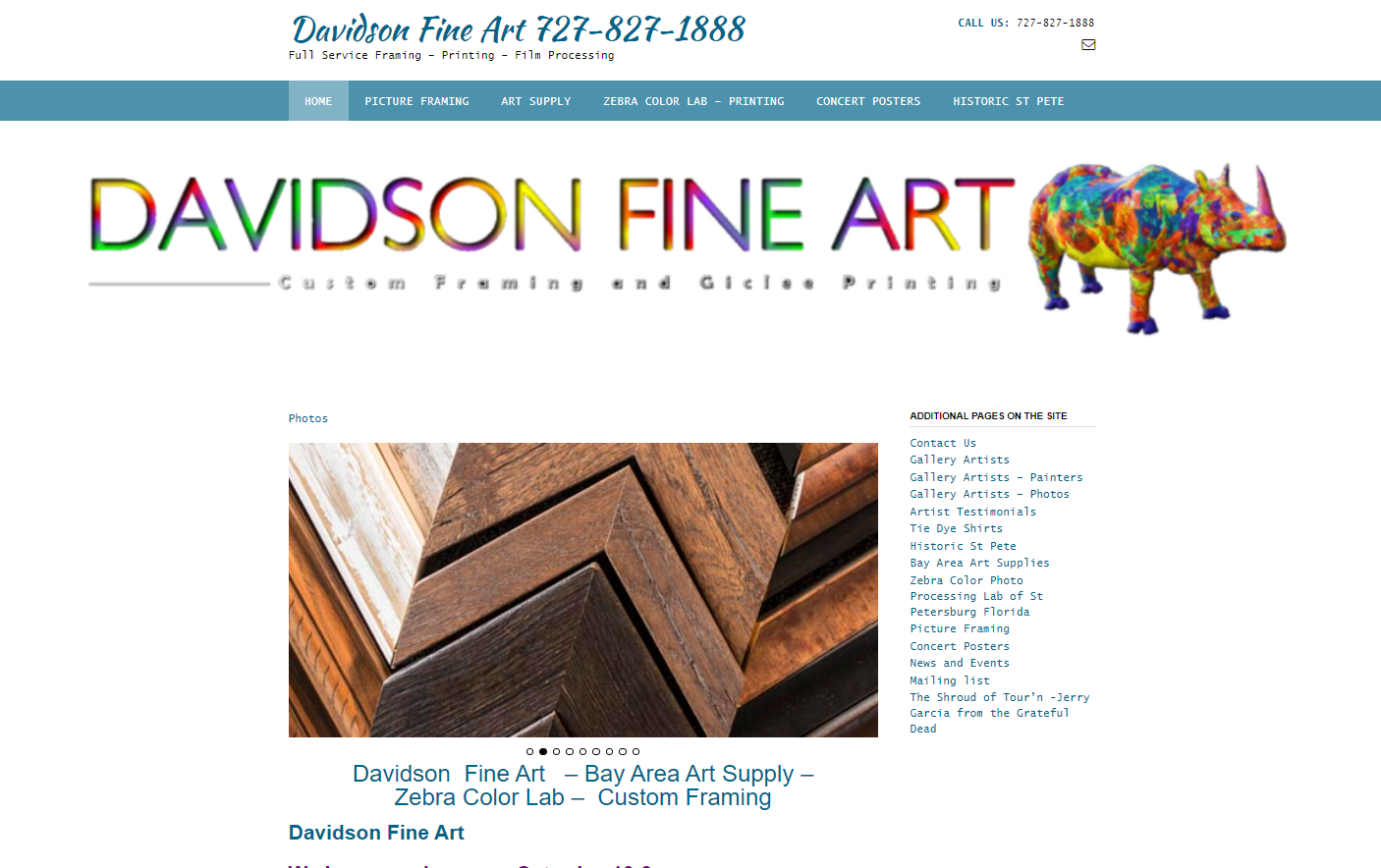
Davidson Fine Arts (DFA) is a local art supply shop located in St. Pete, Florida that takes pride in their customer service and reasonable pricing. They have almost 100 years of picture framing experience and a community first business.
Due to the pandemic, DFA’s face to face contact with their customers have been severely limited and they see an opportunity to support the local community by allowing customers to order products online. Currently the only way to order products online is through a special request on DFA’s Facebook page and the official DFA website is outdated. I was tasked to implement a new checkout system and redesign the landing page of their existing website.
Project Type: Desktop/Mobile
Challenge: Implement a checkout system and redesign home page
Tools Used: Figma & Optimal Workshop
Discover
Card Sorting
I decided to conduct a card sort through Optimal Workshop by importing a comprehensive product list of DFA’s current supplies (75 items). This will allow me to best understand how to structure the information architecture and layout of DFA’s website.


Competitive Analysis
In order to establish an effective checkout system, I constructed a pluses and delta chart of DFA’s direct competitor Blick and Utretcht Art. I chose Blick and Utrecht Art because they are one of the largest art supply company in the U.S.

Pluses & Deltas of Blick and Utrecht Art
Based on the pluses, it is obvious why Blick and Utrecht is considered the best in the art supply industry. I noticed during my research they share the same review and catalog methods because Blick acquired Utrecht in 2014.
I noticed that there were a lot of subcategories while navigating through the website. I kept this in mind by limiting the amount of subcategories for DFA.

Comparative Analysis
I did an element analysis on several companies that have an effective ecommerce system and are not directly competing with DFA. I chose Barnes & Noble, Dick’s Sporting Goods, and Canon because they are not in the same industry as DFA. My element analysis focuses on the landing page and check out process.

Define

Persona: Jason the Careful Critic
Jason is a local freelance artist in his mid twenties that prioritizes product quality over price. He is a detail orientated individual that likes to take his time reading product descriptions and reviews.
Goal: To shop online for quality art supplies for his next project.
Frustrations: Due to covid guidelines, Jason is unable to test out products in person and must rely on online reviews.
Need: A seamless online shopping experience that showcases product reviews.
Problem Statement
Jason needs a way to order quality art supplies online because the current pandemic guideline limits in-person shopping
Design
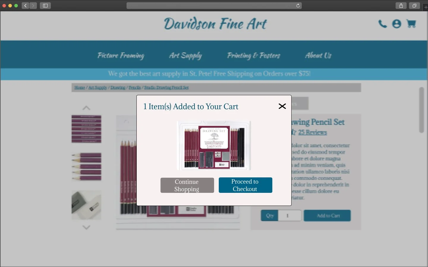
Based on the design challenge and problem statement, I mapped out two user flows. The first user flow focuses on a seamless guest checkout experience. The second user flow addresses Jason’s frustrations of finding quality products through a review system.

User Flow #1

User Flow #2
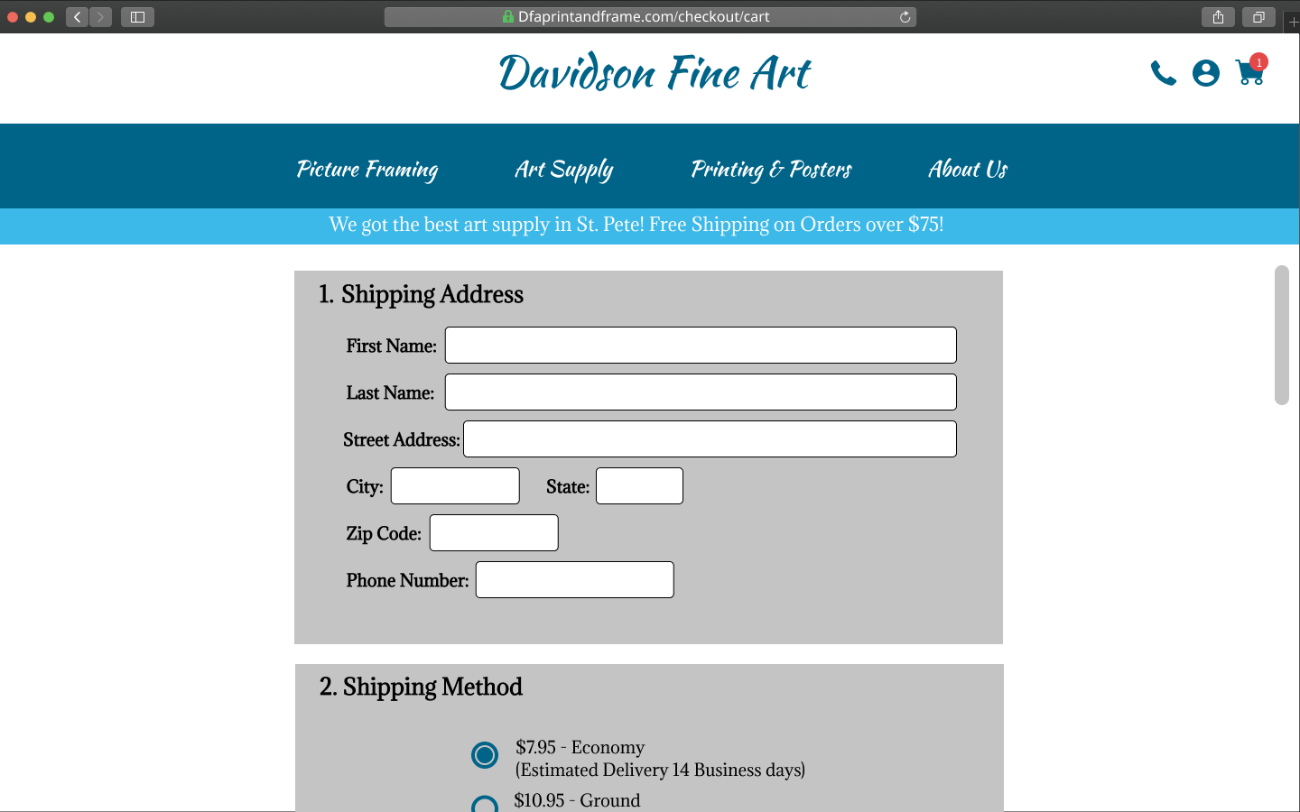
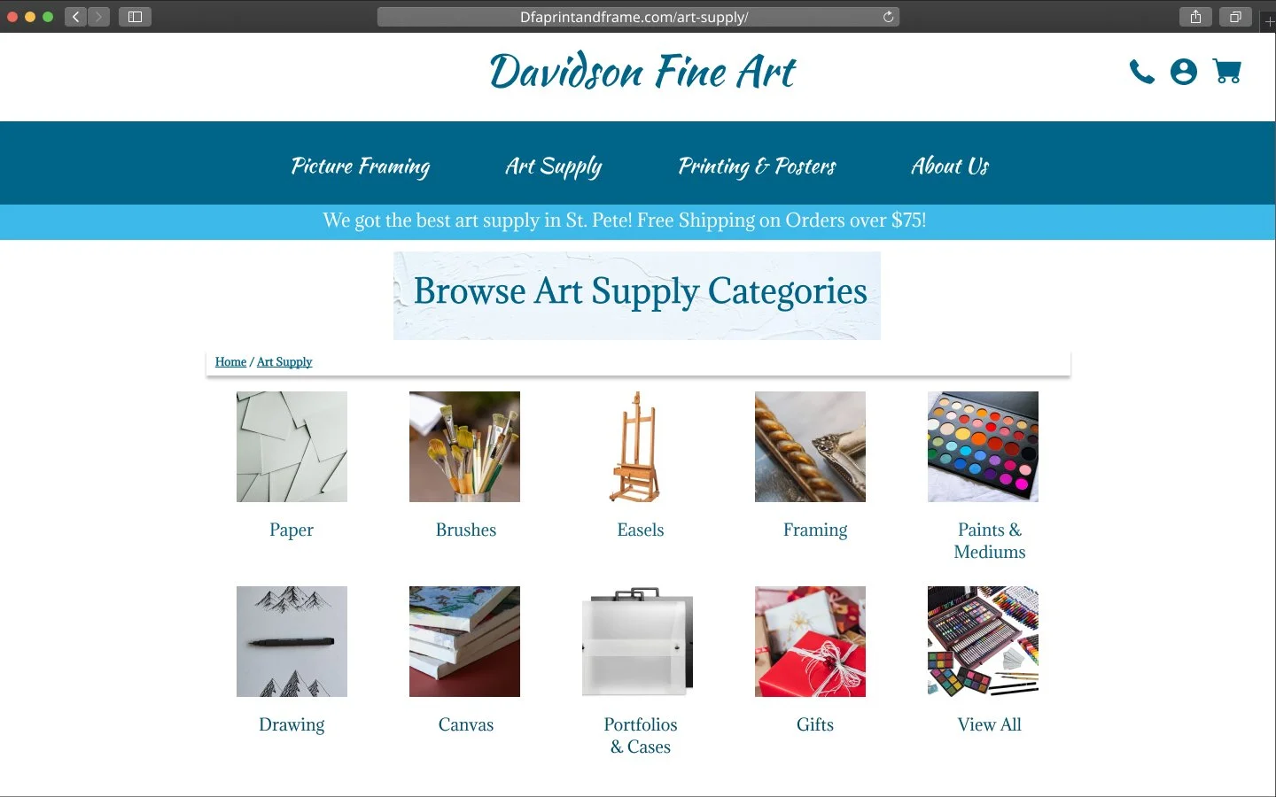
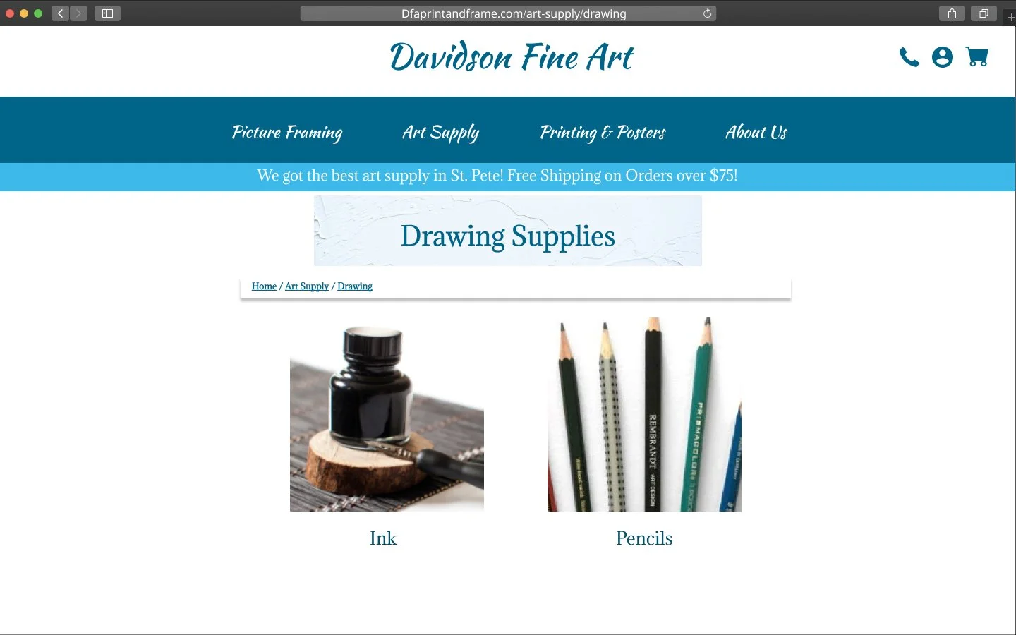
Wireframes
Below are my desktop and mobile mid fidelity wireframes based on the two user flows and the results I gathered from the card sorting earlier. I wanted to keep the original color palette and font choice of DFA to maintain the brand integrity it built within St. Pete over the years.


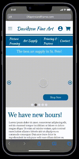
Mobile wireframe based on the first user flow showcasing the user journey from the homepage to the end of the check out process.
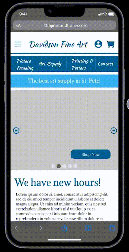
Mobile wireframe based on the second user flow, showcasing the user journey from the home page to writing and submitting a review for a product.
Testing
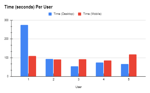
I conducted usability testing based on the comprehension of my user flows and layout of my wireframes. I interviewed five users for both tests.

Post Testing Analysis
Most users prefer to use desktop as their choice of shopping but all users stated that the decision was a personal choice, not because they think one system is better than the other. A user that prefers to use the desktop version stated that “it makes me feel comfortable when I can see everything on the screen and there are multiple filter options.” All users have a positive experience when navigating from the home page to the check out page, as well as submitting a review.

Accessibility became a concern when one of my users was unable to confidently identify the different categories in the product selection screen on the mobile browser. To address this issue, I have enlarged the icon selections and reduced the amount of categories from three to two per row.

Addition of Search Bar
User #5 said he is unfamiliar with art supplies and has never shopped for them before. He suggested inputting a search option so he can easily search for the item he needed instead of browsing through all the categories. To address this issue, I inputted a search bar with a voice to text option on the homepage of the mobile browser. The voice to text option will provide accessibility to users who are unable to type.


Reflections and Next Steps
I went into this spec project with a laundry list of things I would change and update on the Davidson Fine Arts website. I wanted to provide an extreme make over for this website while maintaining its original brand identity. As I got further and further into the design process, I realized a lot of the things I wanted to implement in the website and mobile browser were not entirely flushed out. I was missing certain elements in my mockups, which is far from creating the best user experience. For example in the check out process, I neglect to put a create an account option in the login page and I did not include a progress bar. Also I received feedback on changing the font on the global navigation because a script-like font like Kaushan Script is not ideal as navigation buttons. Although this was one of my first spec projects, I am very grateful and humbled throughout the process because I still have a long way to go and much to learn as a designer.