
Migraine Buddy
New Feature for Existing Application
Project Overview:
Migraine Buddy is the #1 migraine & headache tracking app with over 2.8 million users on the app store. It is designed with the intent to help people monitor behavior, stress, and other factors that could predict the onset of the next migraine attack. Although it is free to download and install, there is a premium version of Migraine Buddy that comes in an annual subscription model. The primary business goal of Healint, Migraine Buddy’s parent company, is to utilize its data collected and provide data driven solutions that empower patients, doctors, and researchers.
In this spec project, I was part of a design team whose task is to incorporate a new feature for Migraine Buddy that would improve user experience and be relevant to its current business goal.
Project Type: Mobile
Duration: 2 weeks
Challenge: New feature for existing app
Tools Used: Figma
Role: Research, Interaction, Visual
Discover
During the initial phase of this project, my team sent out survey questionnaires to individuals who had experienced headaches or migraines in the past. Our goal is to have a starting point and empathize with people who suffer from headaches or migraines. In the end we collected 18 responses in total and from those responses, we reached out to three individuals for a 1 on 1 zoom interview.
Affinity Mapping
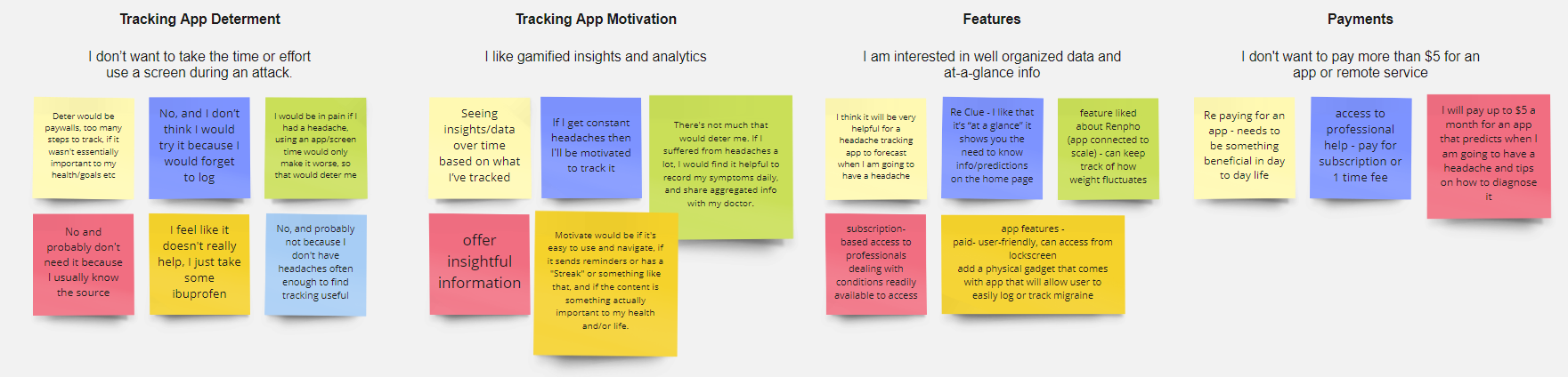
Some notable discoveries we found in our survey questions and interview
Users are deterred from using the tracking app during a migraine episode because the UI is too busy/the process is too long
Users find it hard to justify paying for an app without significant day to day benefits
Competitive & Comparative Analysis
In order to understand the habit tracking market better, we did significant research on Migraine Buddy’s competitors and other industry leaders in habit tracking. We put together a competitive feature analysis of Migraine Buddy’s direct competitors (HeadApp, N1-Headache, and Migraine Insight Tracker) and a comparative feature analysis of similar companies that are not directly competing against Migraine Buddy (Daylio, Myfitnesspal, and Headspace).
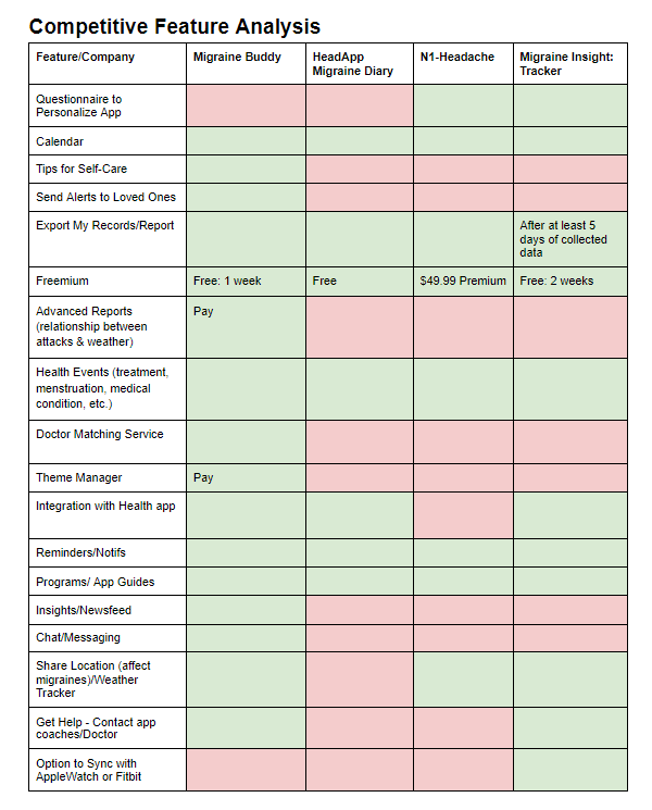
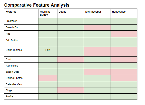
Through our feature inventory analysis, we can see why Migraine Buddy is the #1 rated app in its niche market because it has the majority of the features its competitors do not.
Define
Initially, we wanted to implement a gamification/rewards system into Migraine Buddy that will allow users to explore some of the premium features of Migraine Buddy such as its ability to predict future headache or migraine episodes. We thought this system might help with user retention and will increase the amount of data collected which aligns with the company goals. However, this can do more harm than good because users might input false data to unlock some of the premium features of Migraine Buddy.
We decided to focus on the key finding from our research, “users are deterred from using a tracking app during a migraine episode.” We discovered that Migraine Buddy users are not a fan of the app’s current user interface.
Persona
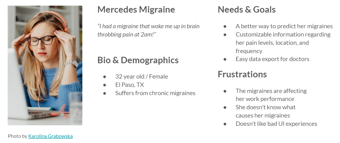
Problem Statement
Mercedes needs an efficient method of customizing, accessing, and sharing her migraine data so she can focus on managing her team and her migraine patterns.
Design
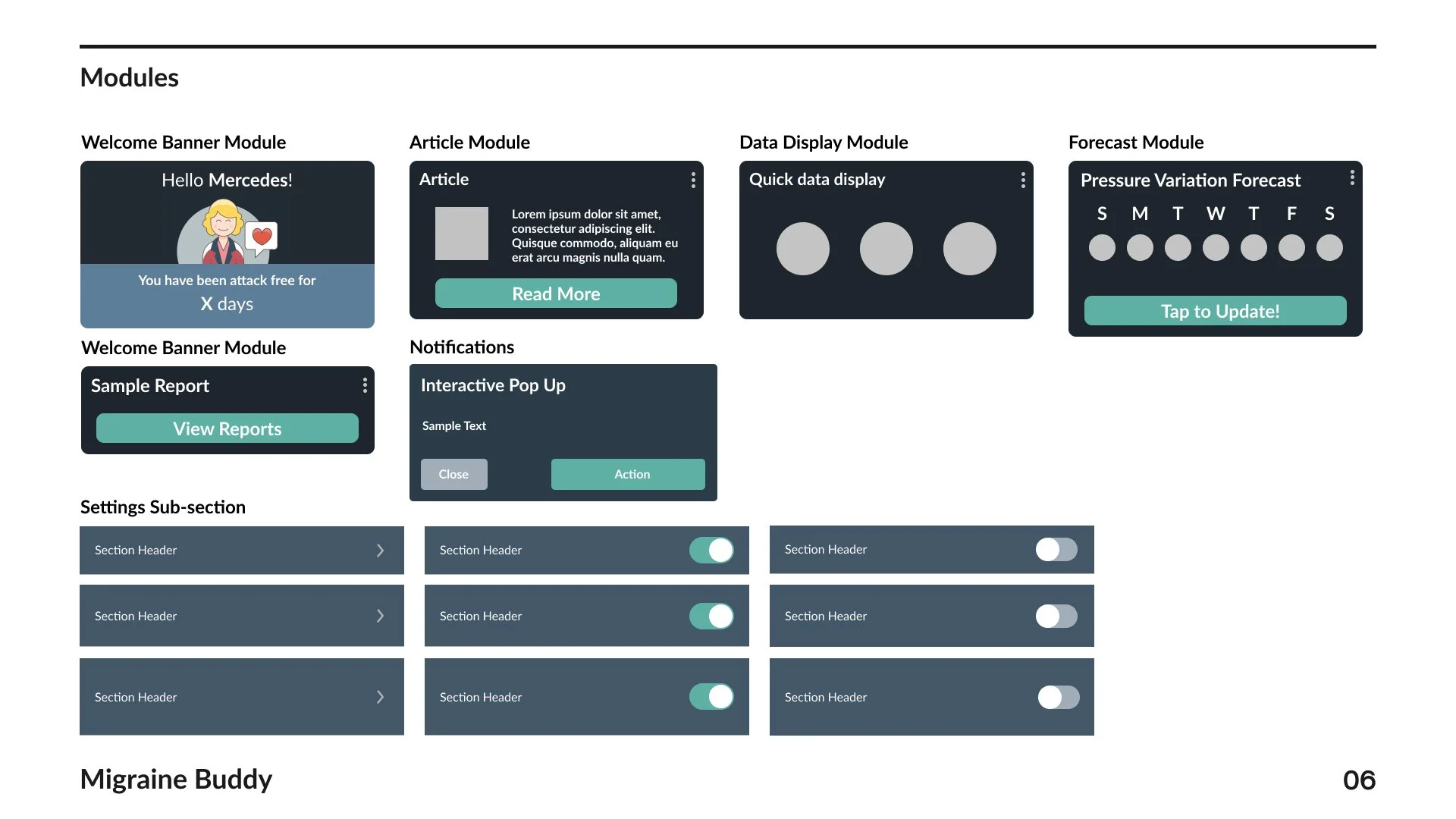
We created two user flows to address Mercedes’ needs of customizing, accessing, and sharing her migraine data. Although our proposed user flows do not dramatically change the existing ones in the app, our goal is to refine and make it more efficient so users have a more simple and linear experience.

User Flow #1 focuses on customizing the homepage of Migraine Buddy. This flow takes the user through the step by step process of turning on and off certain features on the homepage, which is currently not present on Migraine Buddy.

User Flow #2 focuses on exporting the Migraine Impact Report, one of the many reports the user has access to after inputting their migraine data. This flow addresses the efficiency of sharing data from the problem statement.
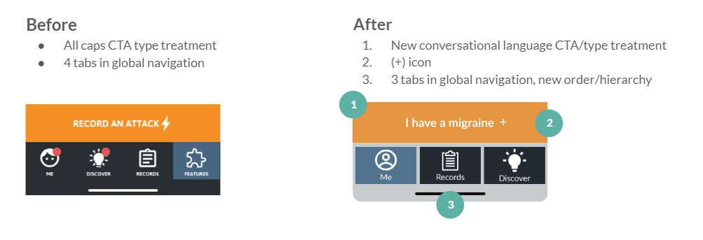
In addition to the homepage content customization, we have also updated the main Call to Action button to reflect a more conversational language, replaced the lightning icon to a plus icon, and reduced the amount of tabs in the global navigation from four to three.
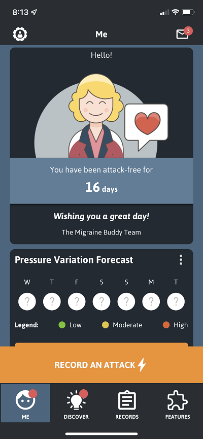
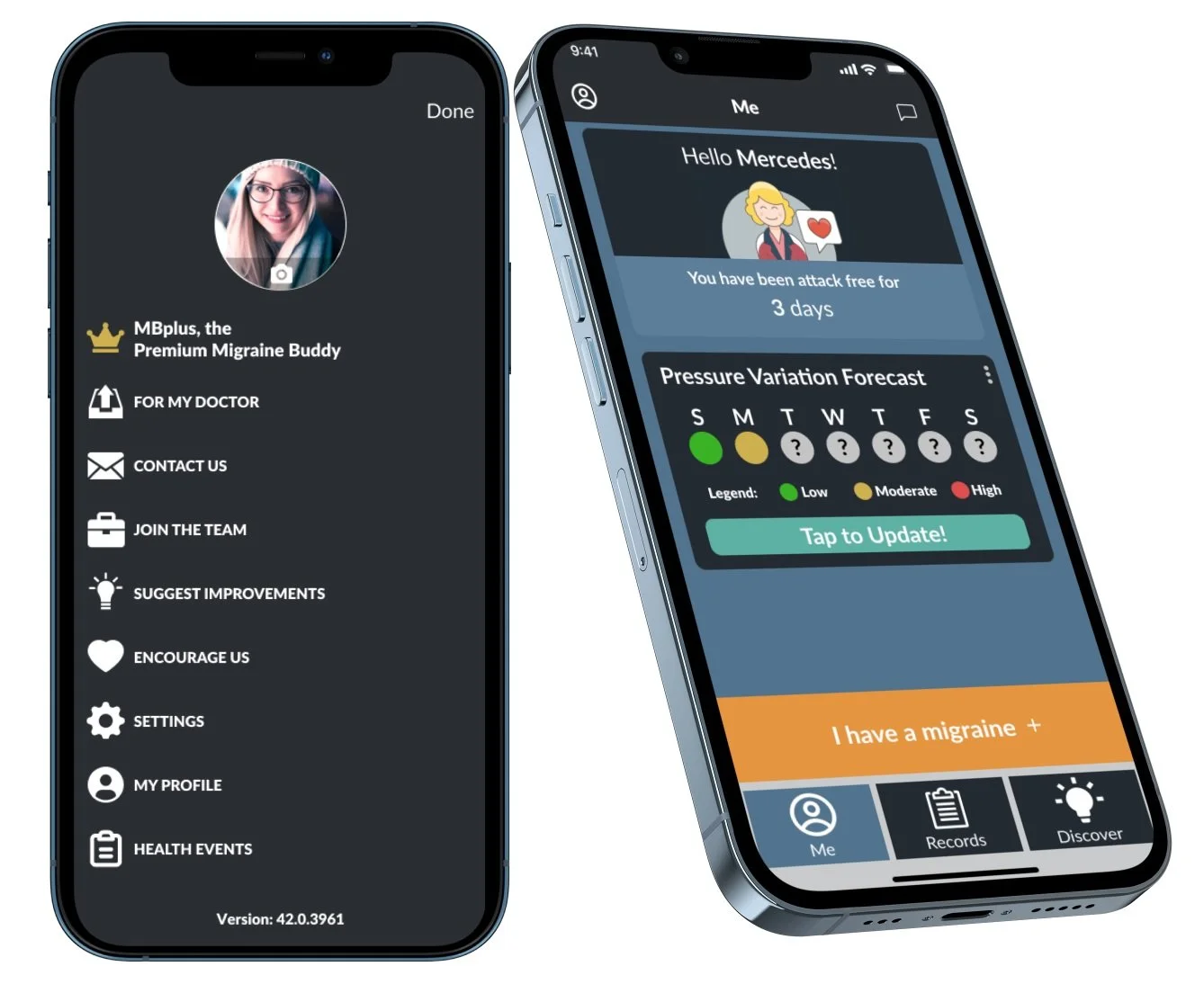
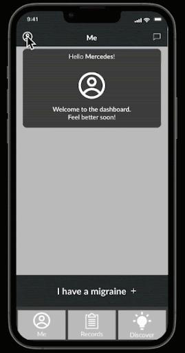
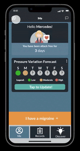
Current Home Page of Migraine Buddy
Wireframe Prototype of our 2 user flows

Proposed New Home Page Layout
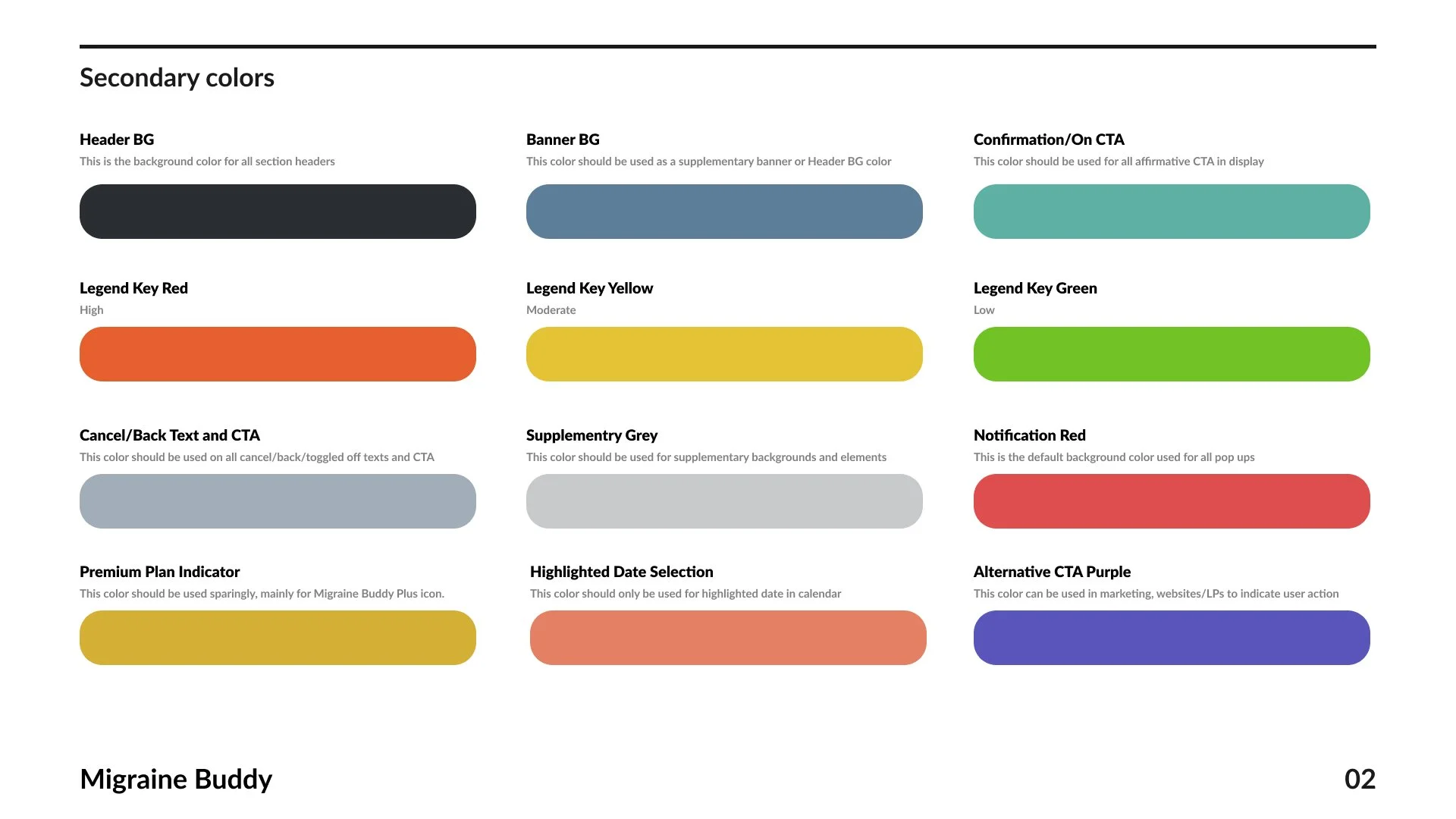
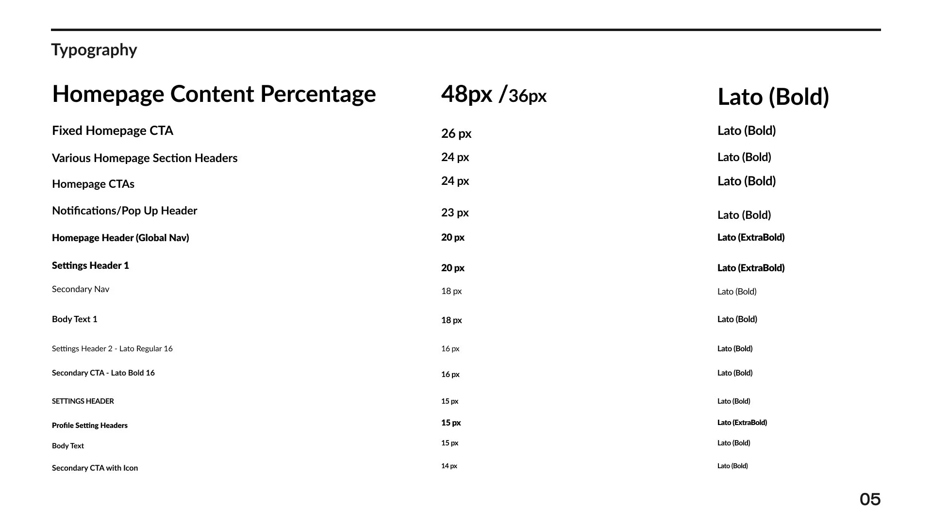
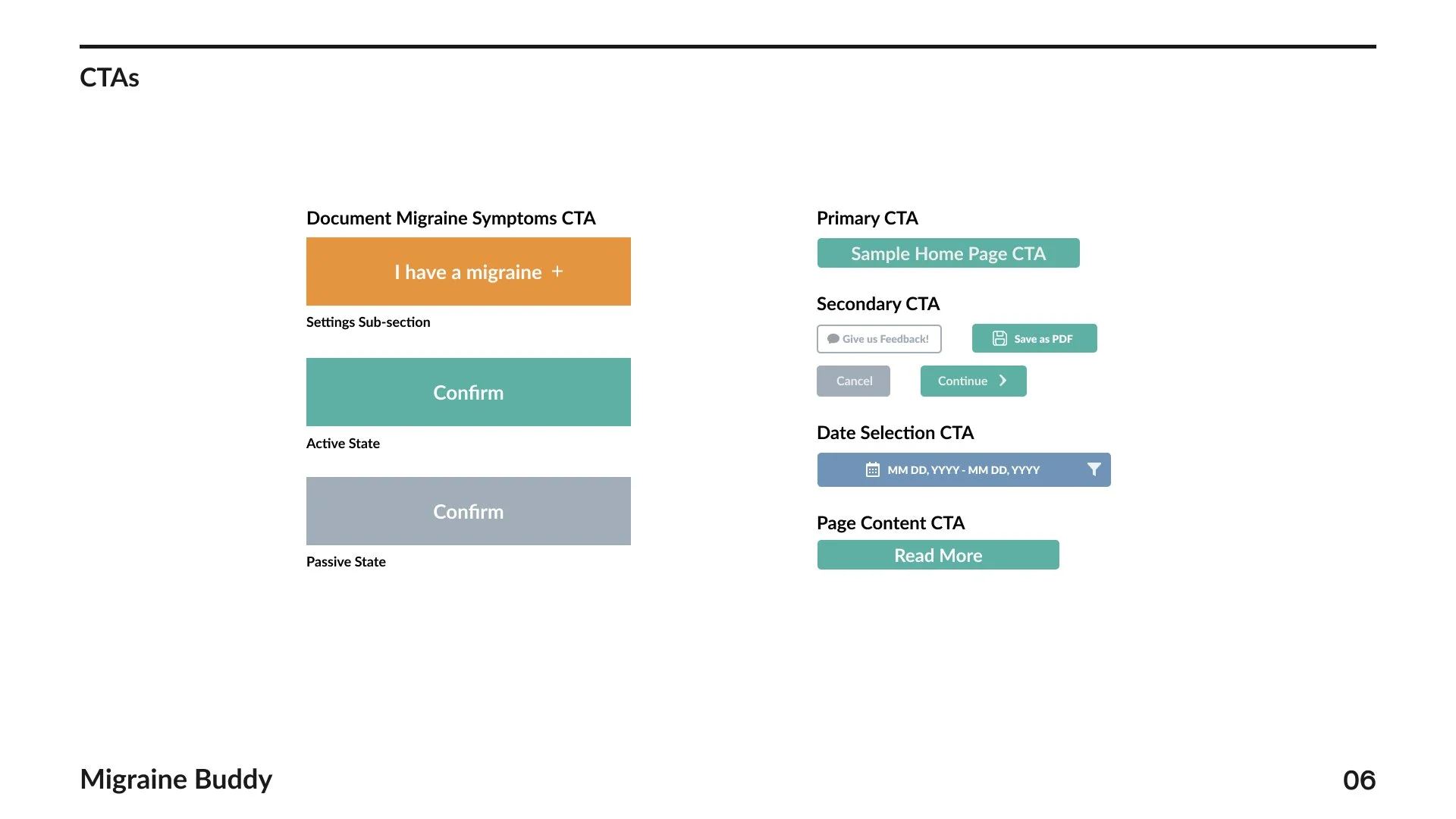
Design System


Testing and Iterations
We conducted two rounds of usability testing with the following scenario, task, and goal. The first round of testing, we used our mid fidelity prototype and the second round of testing, we used our mockup along with the feedback from the previous round.

Round 1 of Testing
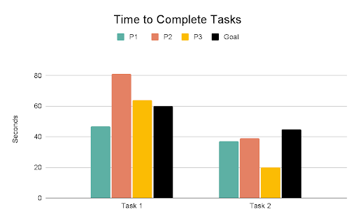
1 out of 3 users successfully completed task within 60 seconds and 11 clicks and 3 out of 3 users successfully completed the task within 45 seconds

Only 1 user was able to complete both tasks within the click threshold
Round 1 Iterations

Based on our observations in task #1, the main pain point expressed by users is the lack of a confirmation window after settings were toggled (input before and after) & quote from user. We proposed a new Call to Action button to confirm the changes made under settings. This will reassure users that the settings that they toggled were saved prior to returning to the homepage.

In task 2, we noticed there was a pain point when users were exporting a report in pdf. Users were unsure of what a MIDAS score is and there was no additional context provided. We proposed a clickable/touch-sensitive tool-tip that provides additional information once hovered.

For our last iteration, we noticed during task #2 that users who reached the end of the task were not quite sure where their PDF had been sent. We decided to replace the pop-up notification with an iOS integrated popup that allows users to select where they would want to send their PDF.
Round 2 of Testing

3 out of 3 users achieved the goal of completing both tasks within 60 seconds and 45 seconds respectively.
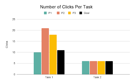
Only 1 user completed task 1 within 11 clicks. This tells us task 1 can still be improved.
Round 2 Iterations

Based on user feedbacks from round 2 of testing, we determined users still do not feel reassured that their changes are saved in task #1 due to the subtle interaction and low contrast color of the Call to Action button. Our proposed solution is to change the color to something higher contrast and include a verbiage change from “Confirm” to “Saved!”
Result of the iterations: Mockup
Reflections
Moving forward, my team would like to explore a Migraine Buddy user’s journey mapping and identify the emotions within different stages of using the app. This will allow us to pinpoint the areas where the users are most frustrated when using the app and we can address them in future updates of decluttering of the user interface.
Personally, this was a very humbling experience because I went in with the expectation and bias of creating a brand new feature for an existing app. My expectations and biases were refuted by the data and feedbacks my team collected. It would be disingenuous to introduce a brand new feature when the users did not ask for one. This was a great learning experience and an example of “addition by subtraction” because our new feature is to take away some of the current ones and refine the user experience.