Cobenfy Website Launch

Project Overview:
COBENFY is a recently FDA approved treatment for schizophrenia. The task is to design a user-friendly consumer announcement splash page for the launch of COBENFY at the end of September. This initial splash page will serve as a preliminary point of contact for patients, caregivers, and the broader schizophrenia community, generating awareness and excitement about the availability of this new therapeutic option. Shortly in mid October, a more robust website will launch with detailed content to provide patients and care partners the information they need to know about COBENFY and schizophrenia. All website wireframes and layouts must adhere to the Build-Easy design system and all copy content are to be written at risk based on timeline.
Project Type: Splash page and full branded website
Duration: 16 weeks
Challenge: Raise awareness and build excitement for newly approved drug to patients
Tools Used: Figma, Build-Easy Design System, WorkFront, and Microsoft Teams
Role: User Experience Architect
Define
Target Audience: Patients with schizophrenia who receive treatment in an out-patient setting (private practices or community mental health centers) and their Care Partners.
Patients with schizophrenia and their Care Partners often seek information, advice and support on symptoms and treatments online. This stems from distrust with HCPs with a history of misdiagnosis and feeling that they are not getting correct answers or are not being treated effectively for their schizophrenia treatments.
We will be addressing the following quote from market research in our design:
“Having schizophrenia comes with so many symptoms, even though I’m taking my meds! Also, the side effects create other problems that make daily life hard. All of this adds up to feeling not like myself anymore. Will I ever get back to the person I once was?”
Our goal is to actively reach our target audience and empower them with the information and tools needed to have more meaningful dialogues with their healthcare providers through high online engagement.
Design
All major content of both the splash page and full website are based on the Interactive Visual Aid (IVA) and Patient Brochure (print piece) which are two other projects being created in tandem. As the UX architect, I lead three creative co-op sessions with the lead copywriter, art director, strategy analyst, product designer, and account management to pin point and finalize on the information architecture for both the splash page and full website.
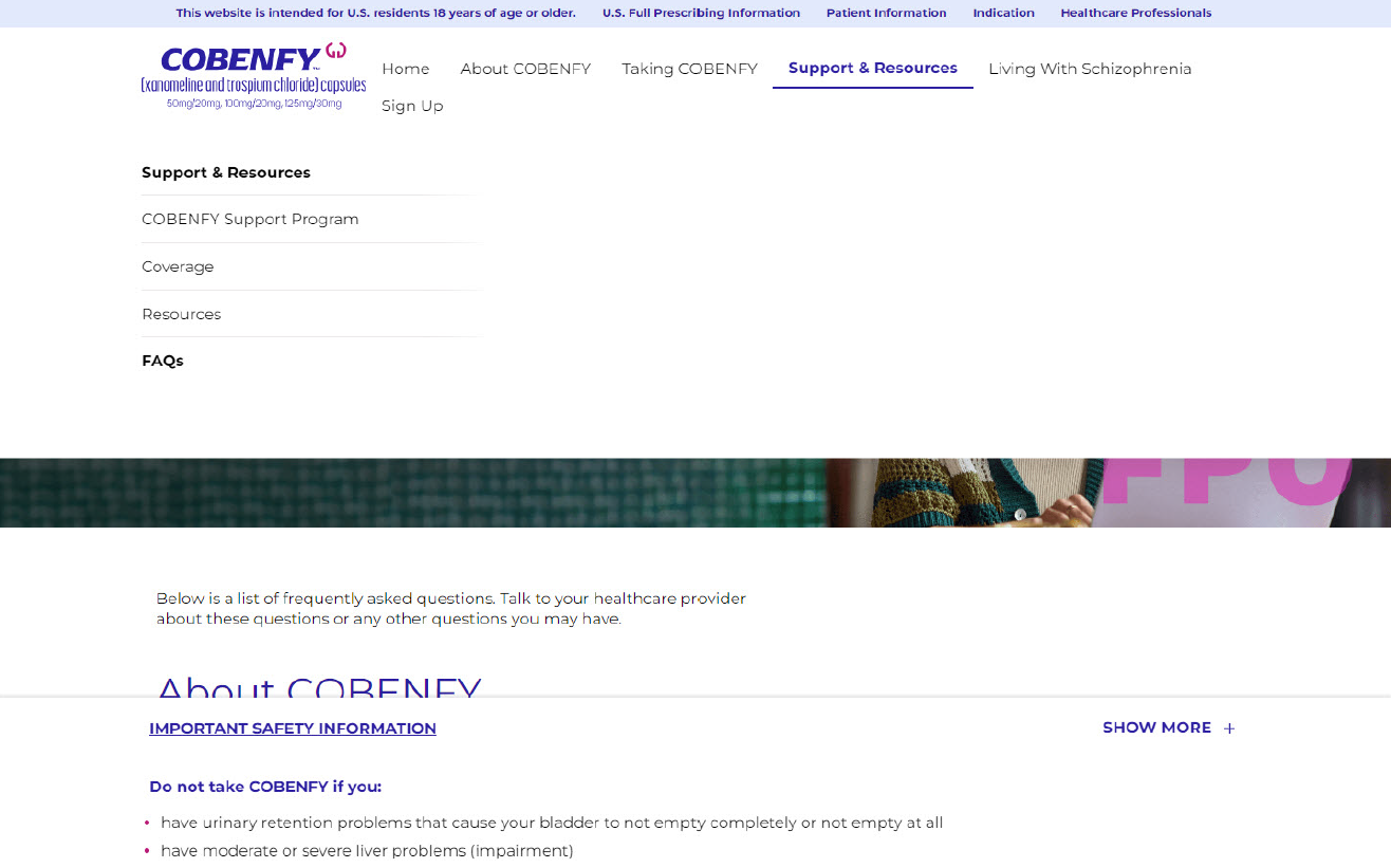
Site Map: We created a total of 6 main navigation items for the full website based on key messagings and content from the IVA and Patient Brochure. The utility, footer, and system navigation items are based on branded website best practices.
Below are some of the controversial structural decisions we made at the time:
U.3 Indication: This is required to a pop up overlay for ALL users when they land on the homepage. Despite our recommendation against this functionality, clients insisted this feature is required on all BMS website based on their design system.
5.0 Sign Up: We wanted a more patient friendly language for this page like “Stay Connected” or “Keep me informed” because “Sign Up” is too directive and makes users feel like they are doing a chore but we had to keep “Sign Up” due to the timeline and number of forms client is moving forward with on their end.

First version of the site map created from the creative co-op sessions
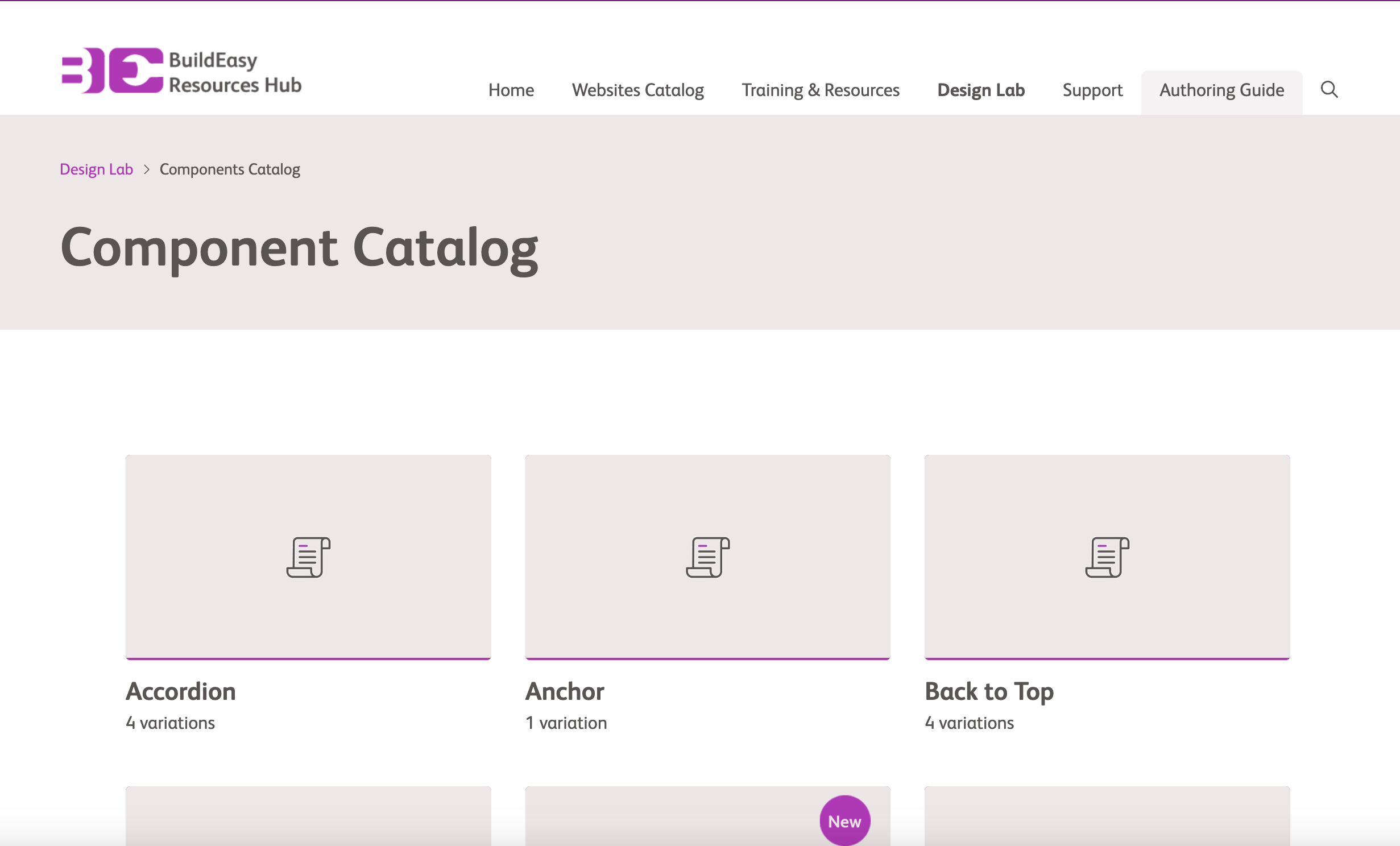
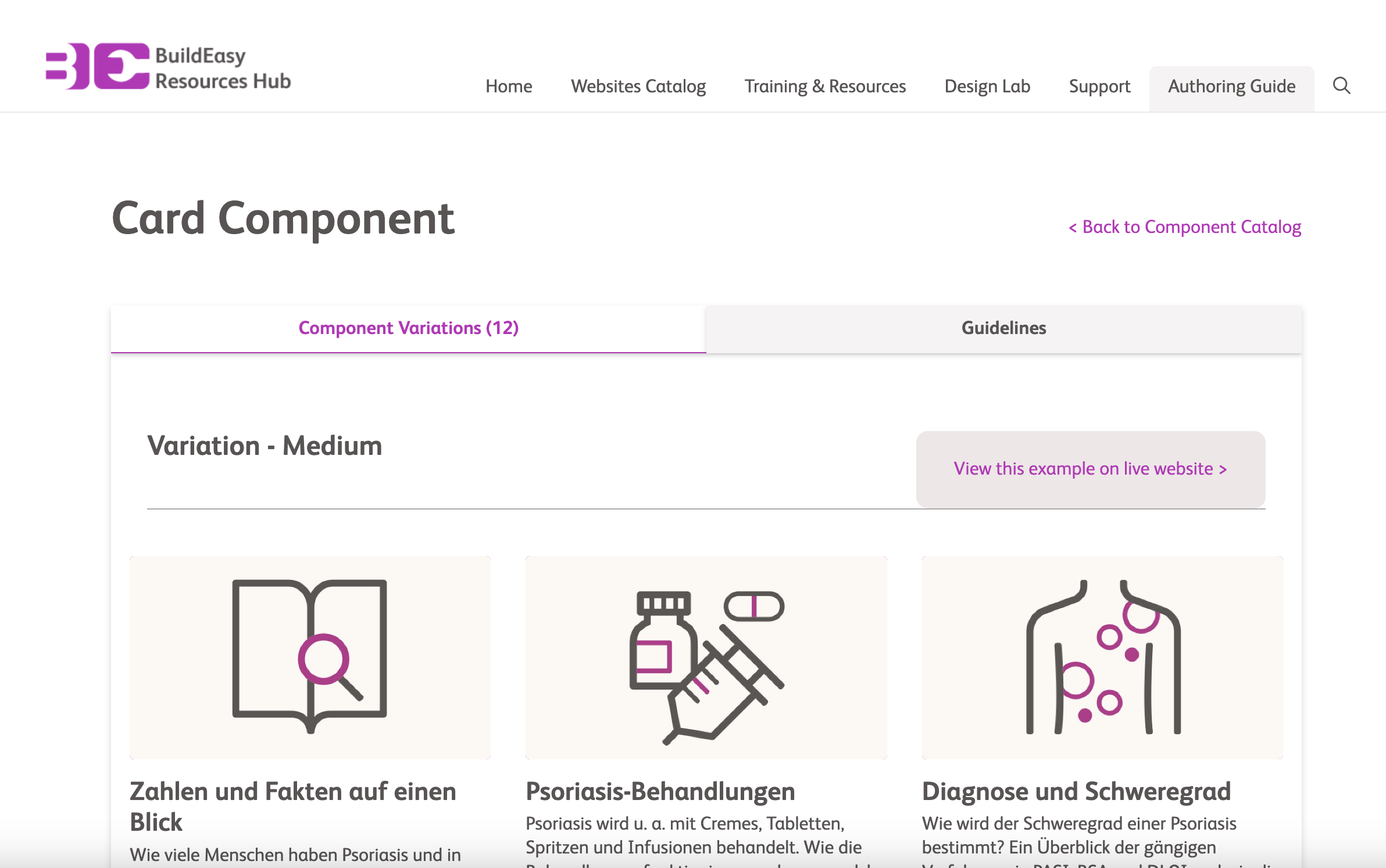
The Build-Easy Design System: This is a pre-build design system from BMS and the client’s development team based on their research on user experience best practices. All wireframes and layouts must align with the Build-Easy design system. This is especially challenging because the Build-Easy design library is not available on Figma and detailed specifications for each components are unavailable to my team. This ultimately lead to a lot of headaches and last minute changes right before launch.

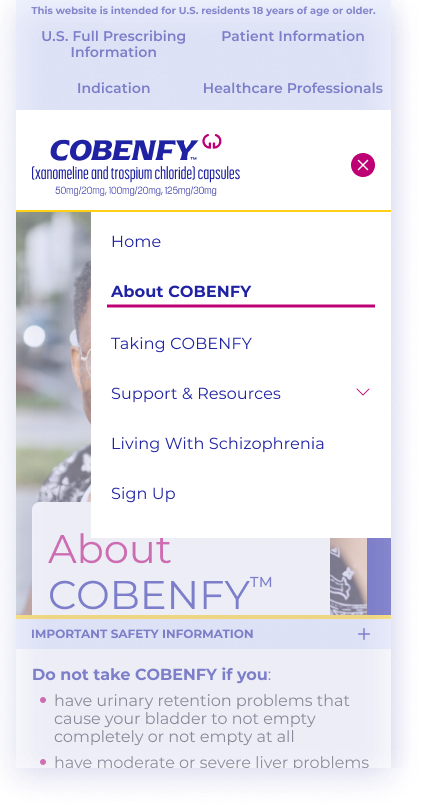
Wireframes: The purpose of my wireframes are to get client and developer approval for structure and component selections so my team can get started on layout creation. All content copies besides the site map pages are Greeked due to the fact that none of the manuscript have final approvals because content selections are not finalized on the IVA and Patient Brochure.
This is not part of our normal design process because wireframes require at least an approved content outline to begin but this was a complicated project with a tight deadline.


Layouts: Below are the layouts created by our product design team. They are based on my wireframes and the Build-Easy Design system. There were multiple client reviews during this part of the process where we have to swap different components and major contents on multiple internal pages.

Homepage
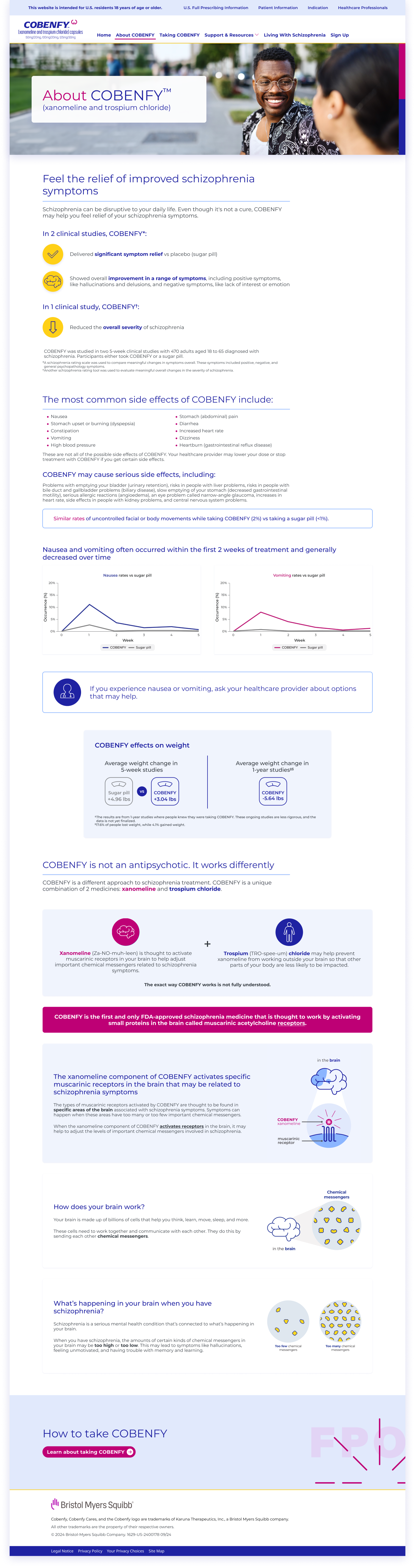
About COBENFY
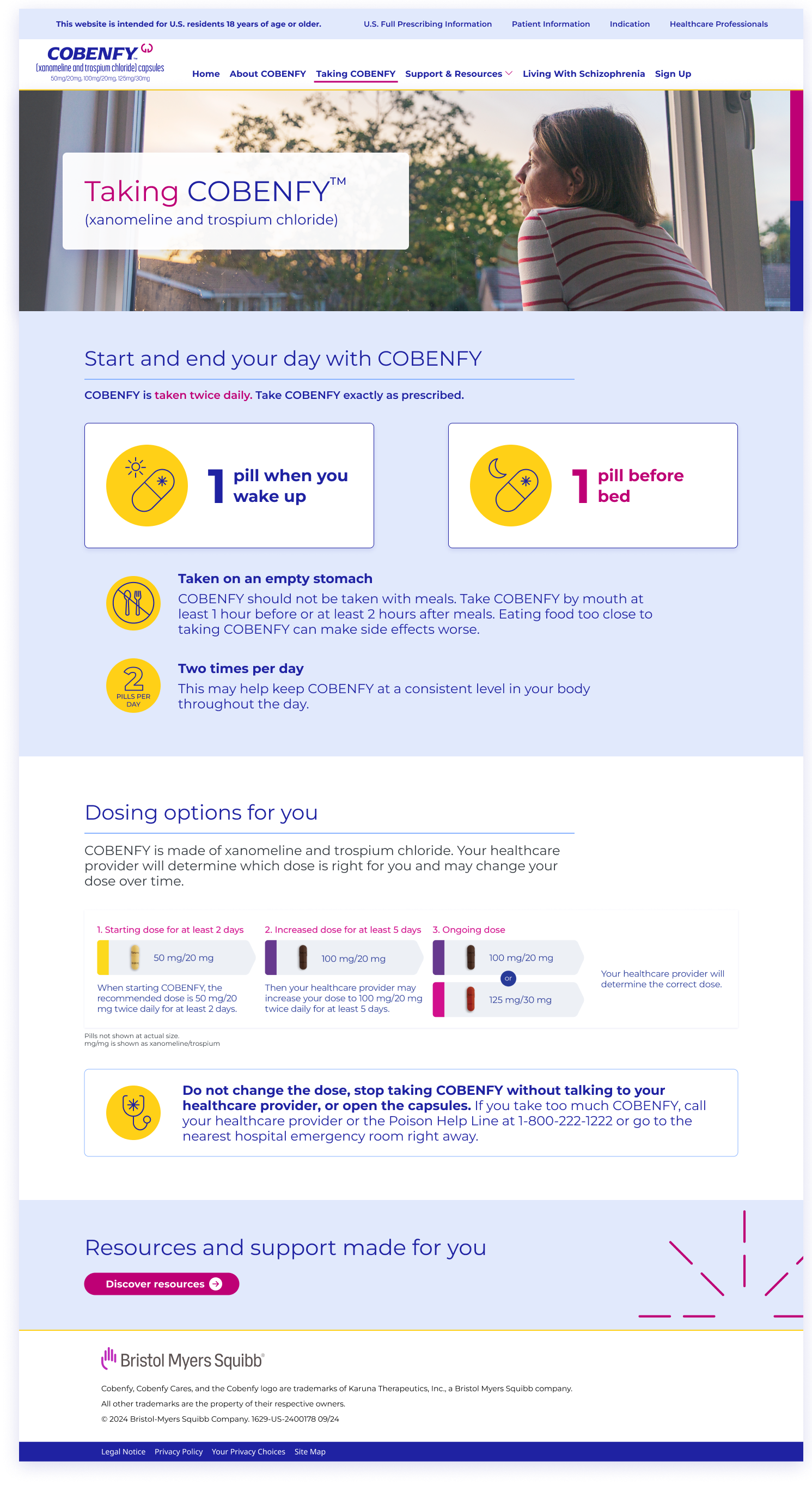
Taking COBENFY
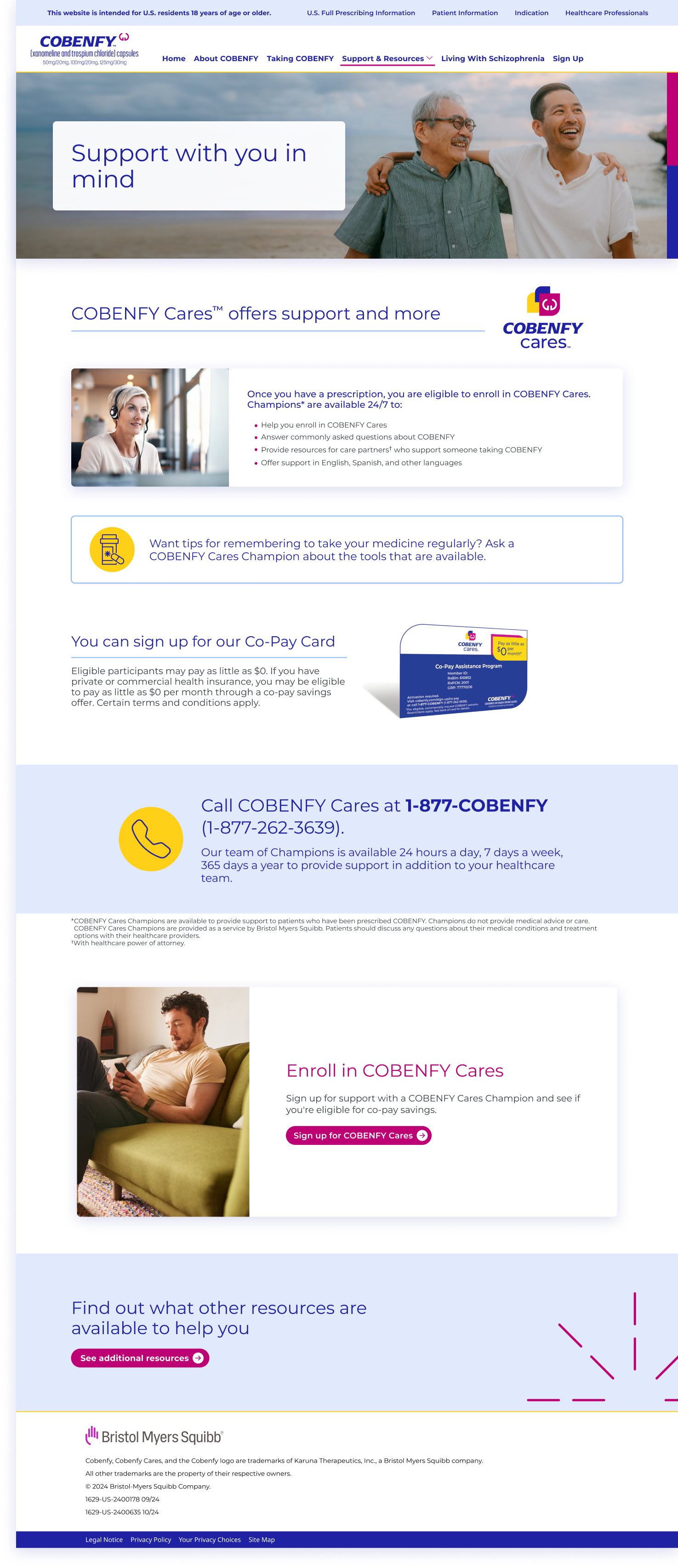
Support Program
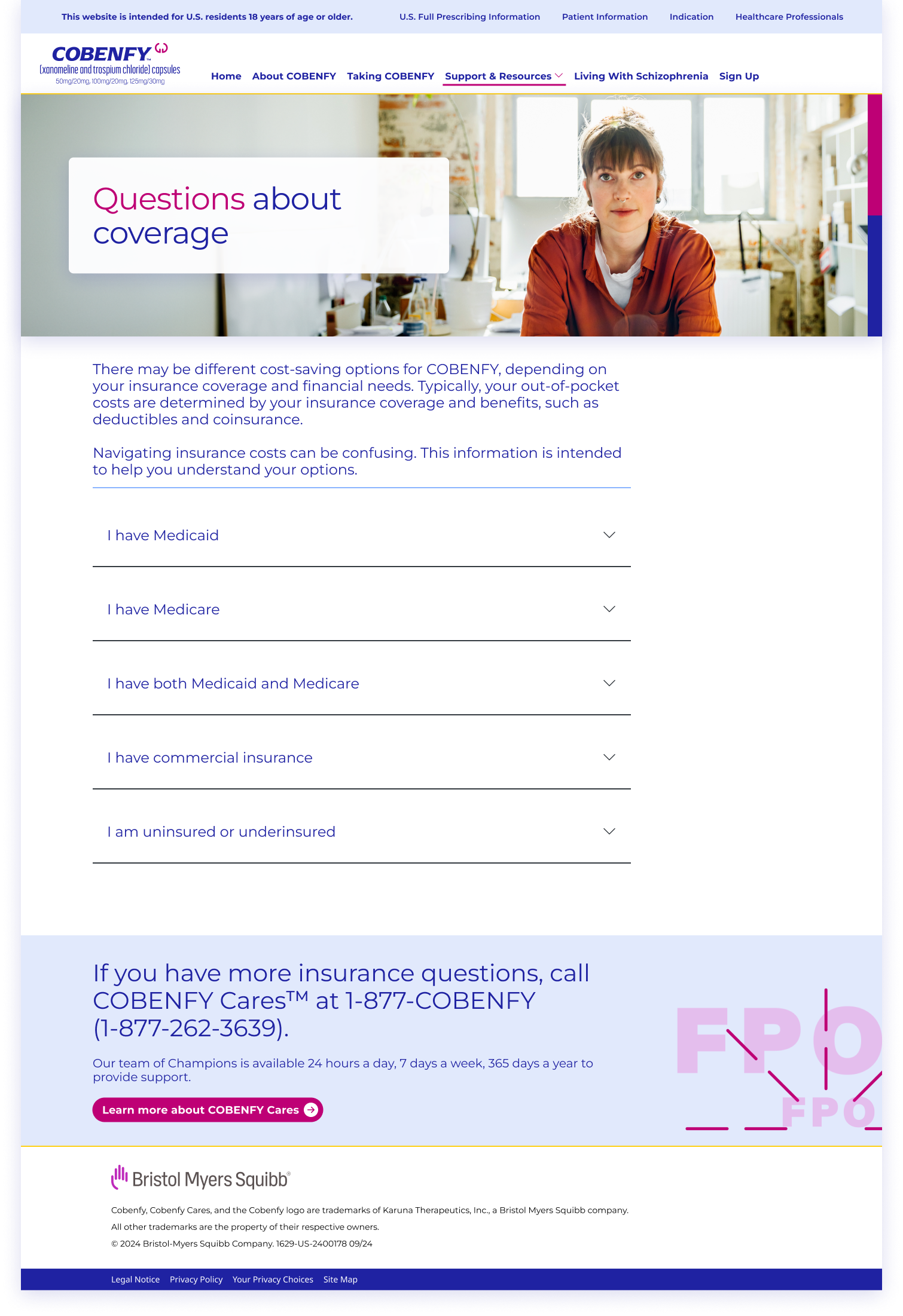
Coverage
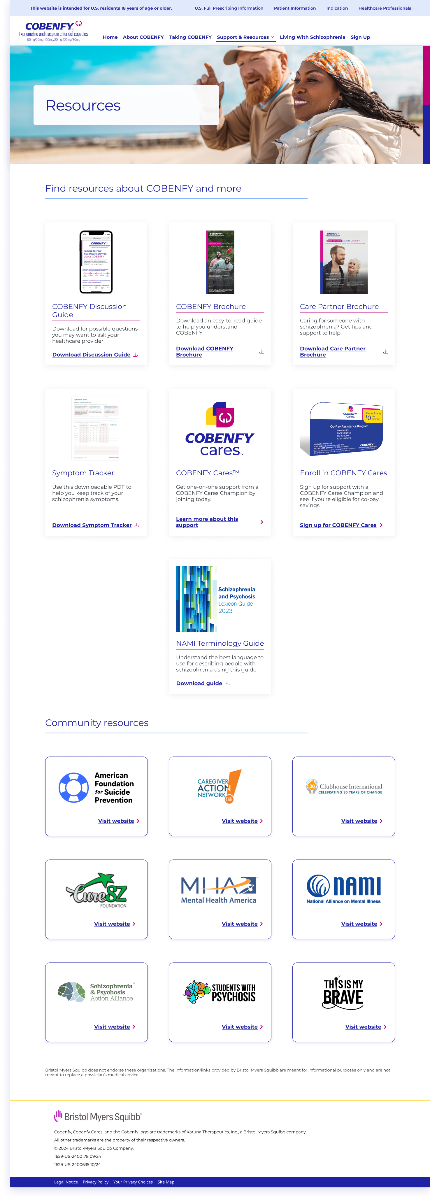
Resources
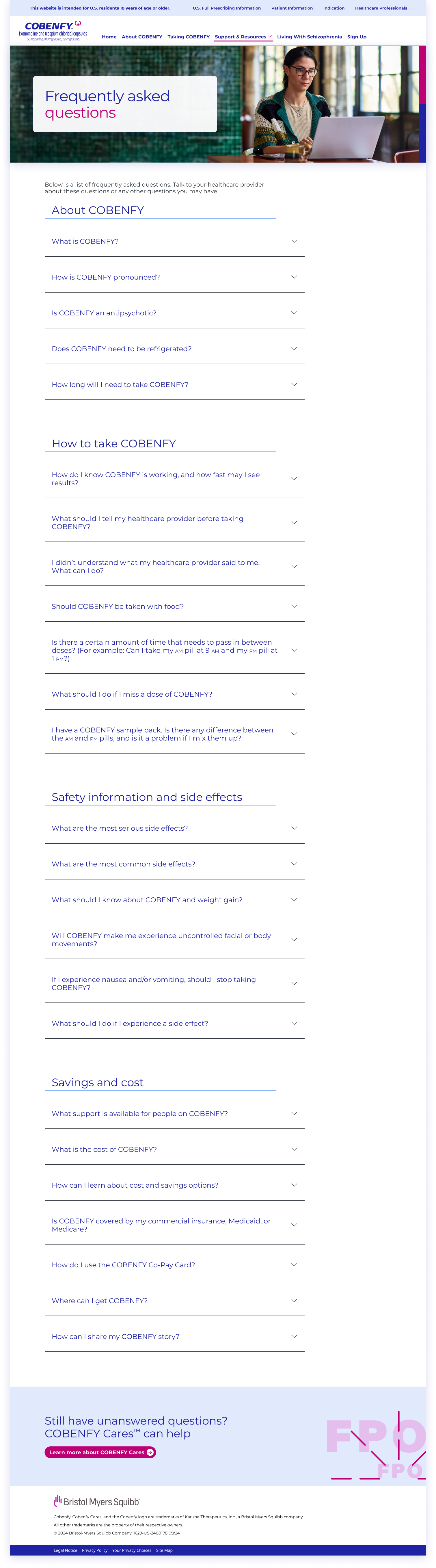
FAQ
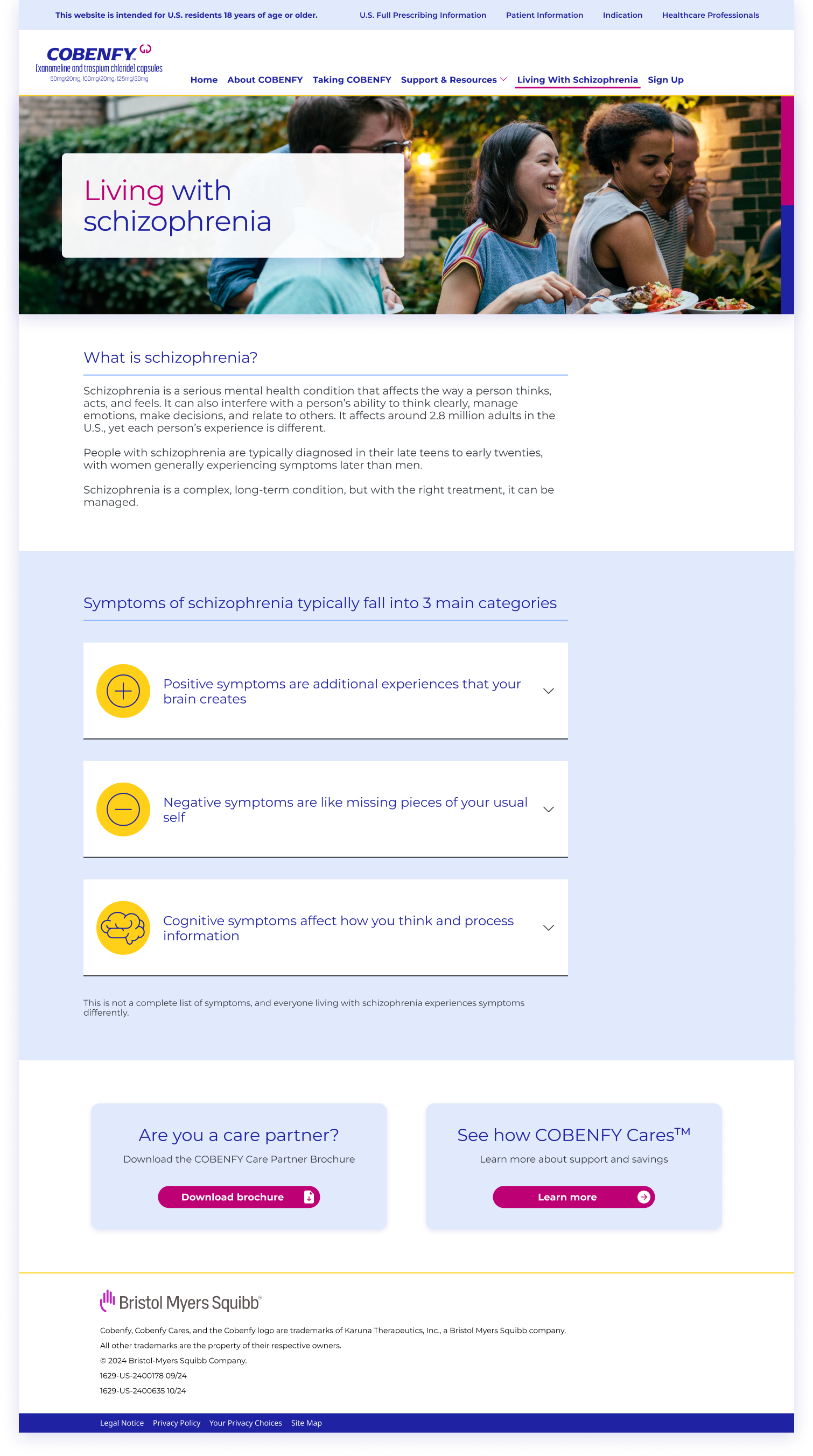
Living with schizophrenia
Staging and Iterations
Staging links for the splash page and full website were received in early October. Initial revisions were focused on resolving significant discrepancies between the desired layout and component integration within the Build-Easy design system. There were over 300 comments were documented in WorkFront to address these issues with the development team. Changes have to be made to the layout to accommodate the design system limitations on the staging site.
Major Staging Link Errors:
Main Navigation missing chevrons for pages that have subpages (Support & Resources)
Mobile hamburger menu is missing the close icon and copy
Active state missing on main and subpages in the navigation
Main button in forms are in active state when none of the form fields are completed
Utility Navigation on layout must be expanded on mobile and hyperlinks must be removed to match the Build-Easy component
Download icons are missing in resource card components
Layout vs Staging
Layout of mobile hamburger menu expanded

Staging screenshot of mobile hamburger menu expanded (copy “Menu” was added, different chevron style, utility navigation copy breaking into two lines, etc)

Layout of desktop main navigation
Staging screenshot of main navigation (different dropdown style, lack of bold in main pages, and incorrect active states)
Final Push to Live
The IVA and Patient Brochure were finally approved for distribution on October 7th. The splash page launched successfully on October 14th, followed by the full website launch on October 22nd.
Due to the late final approval of the IVA and Patient Brochure, there were numerous content changes that impacted the layout. This resulted frequent reviews of every change we made on layout to the staging link to ensure design system accuracy while adhering to UX best practices.
While the splash page launch was successful, the full website launch faced challenges due to significant layout and staging discrepancies. This resulted in extended working hours leading up to the October 22nd deadline.
Link to the full website
Reflections, Post-Mortems, and Future Updates
This project tested my tenacity as a designer and ultimately gifted me an invaluable 16 weeks of experience. Looking back, I was very hesitant in taking this project because the client recently dropped their previous agency and the timeline was extremely tight. Almost everything was unconventional from the start of project kickoff to the go live date. As a creative team, we struggled to navigate and balance the library of wants from the client and the needs of our target audience and users while being restricted to the Build-Easy design system.
We normally have one client review of layout but with this project there were five client reviews of the layout because the content was constantly changing based on the IVA and Patient Brochure. One day we might be laying out the finishing touches of an internal page and the next we were told that page might be discarded due to last minute strategic directions. In the end, there were a total of 60 versions of the layout on WorkFront.
There were numerous times we had to escalate and push back on client changes due to the unrealistic expectation the account team is telling the clients. Two weeks following the website launch, an internal post-mortem was conducted with the creative team to identify areas for improvement and prevent future recurrences of similar issues. Subsequently, a formal post-mortem meeting was held with the clients and their development team to establish aligned expectations for future updates.
Future Updates
A campaign update for the COBENFY website is scheduled for Q1 2025 to integrate their BE messaging. As a pre-requisite of this update, I conducted a site audit to address outstanding issues. This audit focused on updating Build-Easy components to align with UX best practices and implement previously unfeasible changes due to time constraints. Below are some recommendations from my audit: