
LEQVIO Touch Panel
Project Overview:
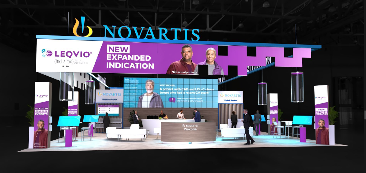
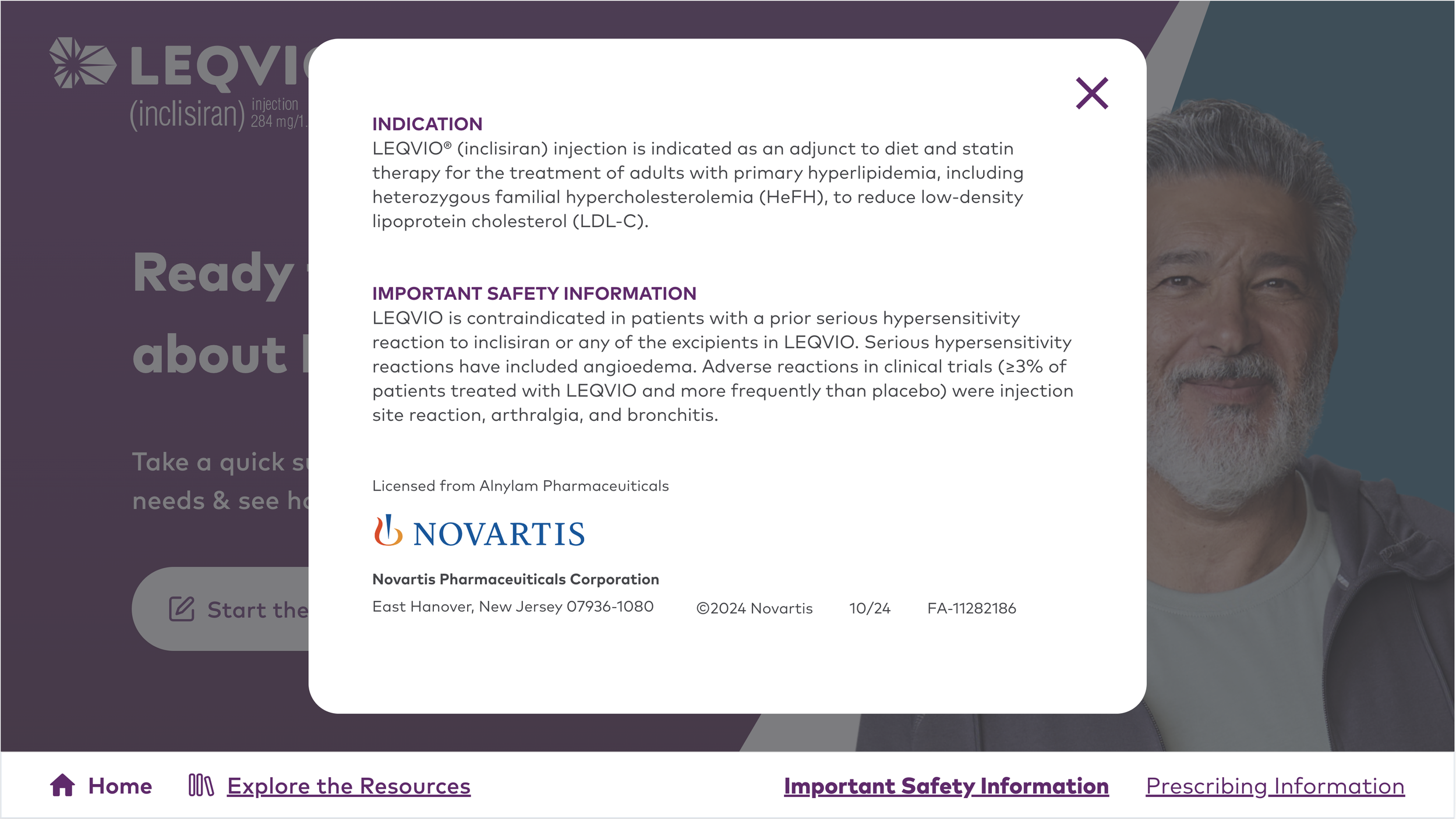
LEQVIO participated in the American Heart Association (AHA) Congress 2024 and we were tasked with designing an interactive booth experience for their 50’x50’ commercial booth to promote their prescription medication for adults with high cholesterol. The booth featured hanging signs, focal walls, pillars, and engagement pods. My team was responsible for developing a digital experience within the engagement pods to educate healthcare professionals on LEQVIO’s clinical significance in improving cholesterol through promoting medication adherence.
Project Type: Touch Panel at a convention
Duration: 12 weeks
Challenge: Raise awareness on LEQVIO’s clinical significance of adherence for healthcare professionals
Tools Used: Figma, WorkFront, and Microsoft Teams
Role: User Experience Architect
Discover
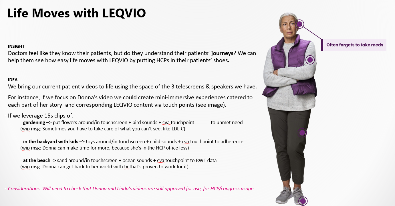
Creative Workshop: My team, composed of a copywriter, strategy director, account manager, user experience architect, and product designer lead, conducted a creative workshop to explore touch panel concepts for the AHA Congress. Below are some of our initial explorations:
Define
Target Audience: Healthcare Professionals attending AHA 2024 (Interventional Cardiologists, Cardiologists, Endo, Lipidologists)
Overall market strategy:
Bring the full LEQVIO story to life with a focus on communicating the story of patient unmet needs after a recent event to compel HCPs to identify LEQVIO patient and reframing adherence as a driver of concrete clinical outcomes enabled by HCP administration.
Problem Statement:
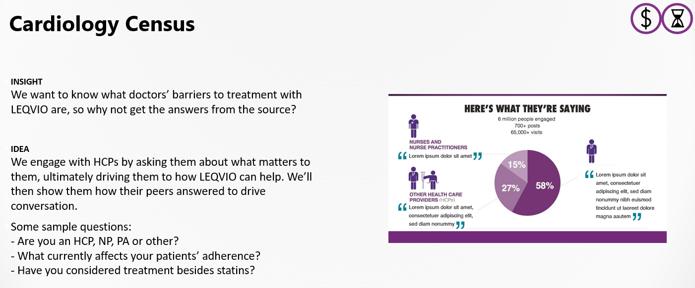
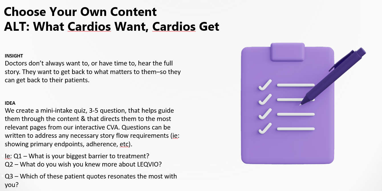
To effectively address the barriers healthcare providers face when prescribing LEQVIO, direct primary research with physicians is crucial to gain valuable insights into their prescribing behaviors and identify areas for improvement.
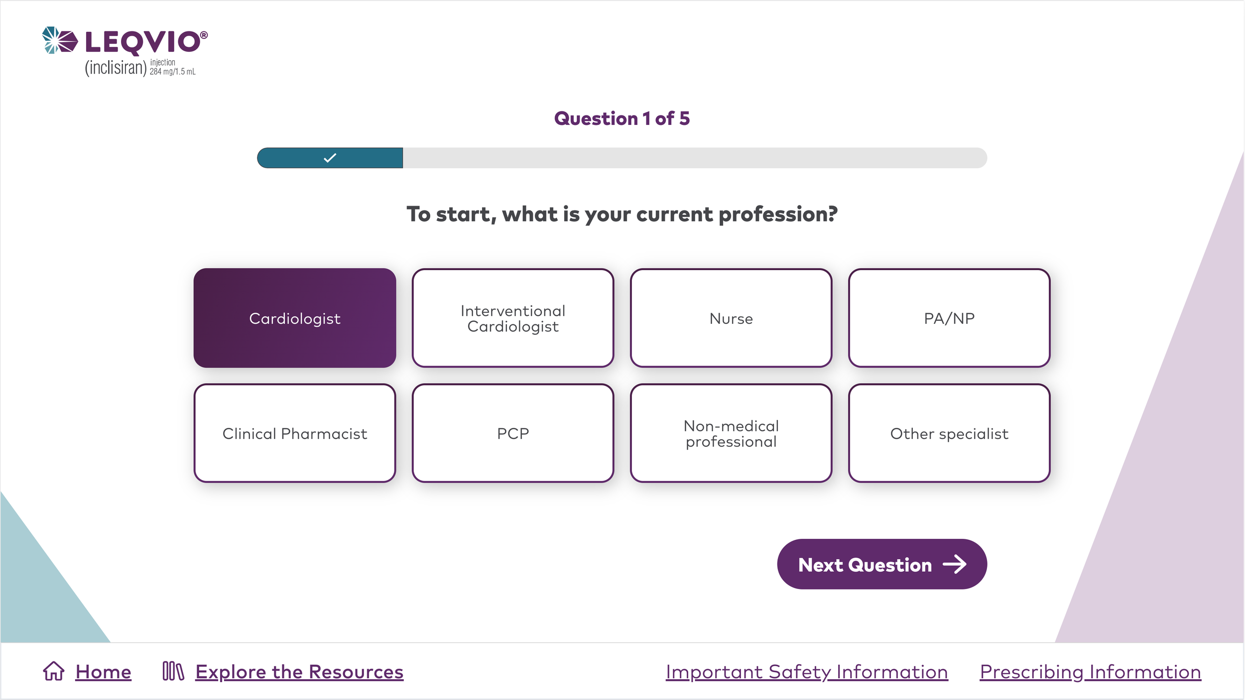
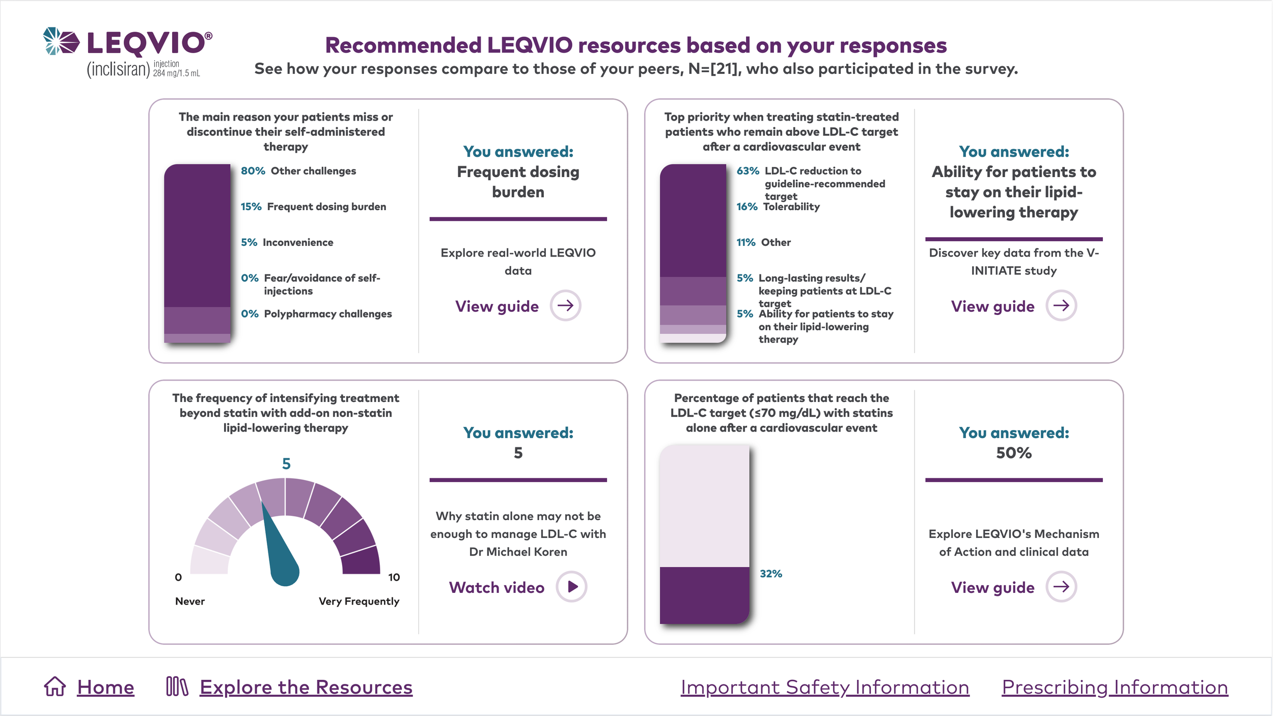
Based on this problem statement and the technical capabilities of the booth vendors, the Cardiology Census was selected as the preferred solution. This interactive experience will engage HCPs with a brief quiz and provide personalized insights by comparing their responses with those of their peers.
Design
User Flow: A well-designed user flow is crucial for the success of our Cardiology Census. I developed the following flow with valuable input and collaboration from the copy and strategy teams:
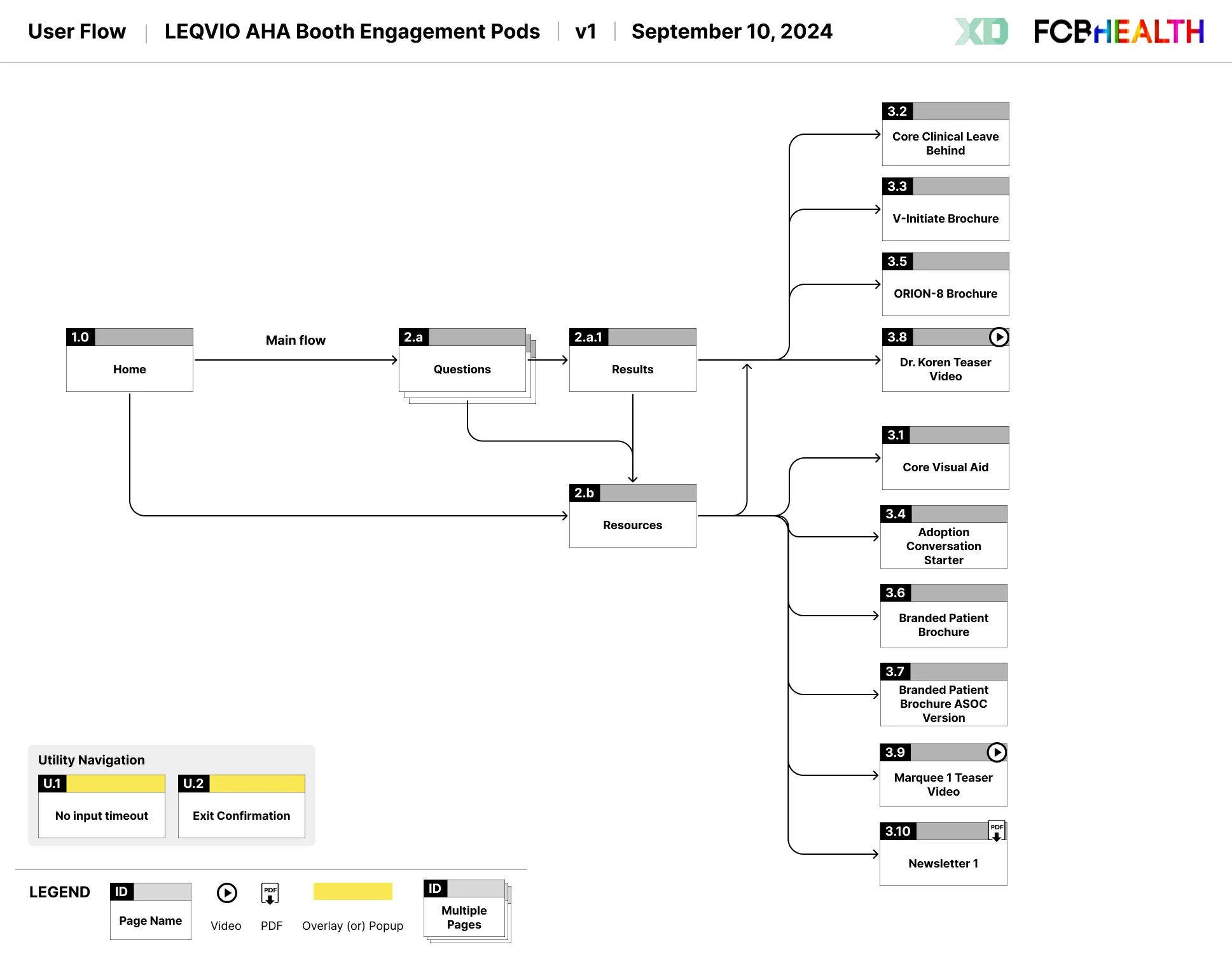
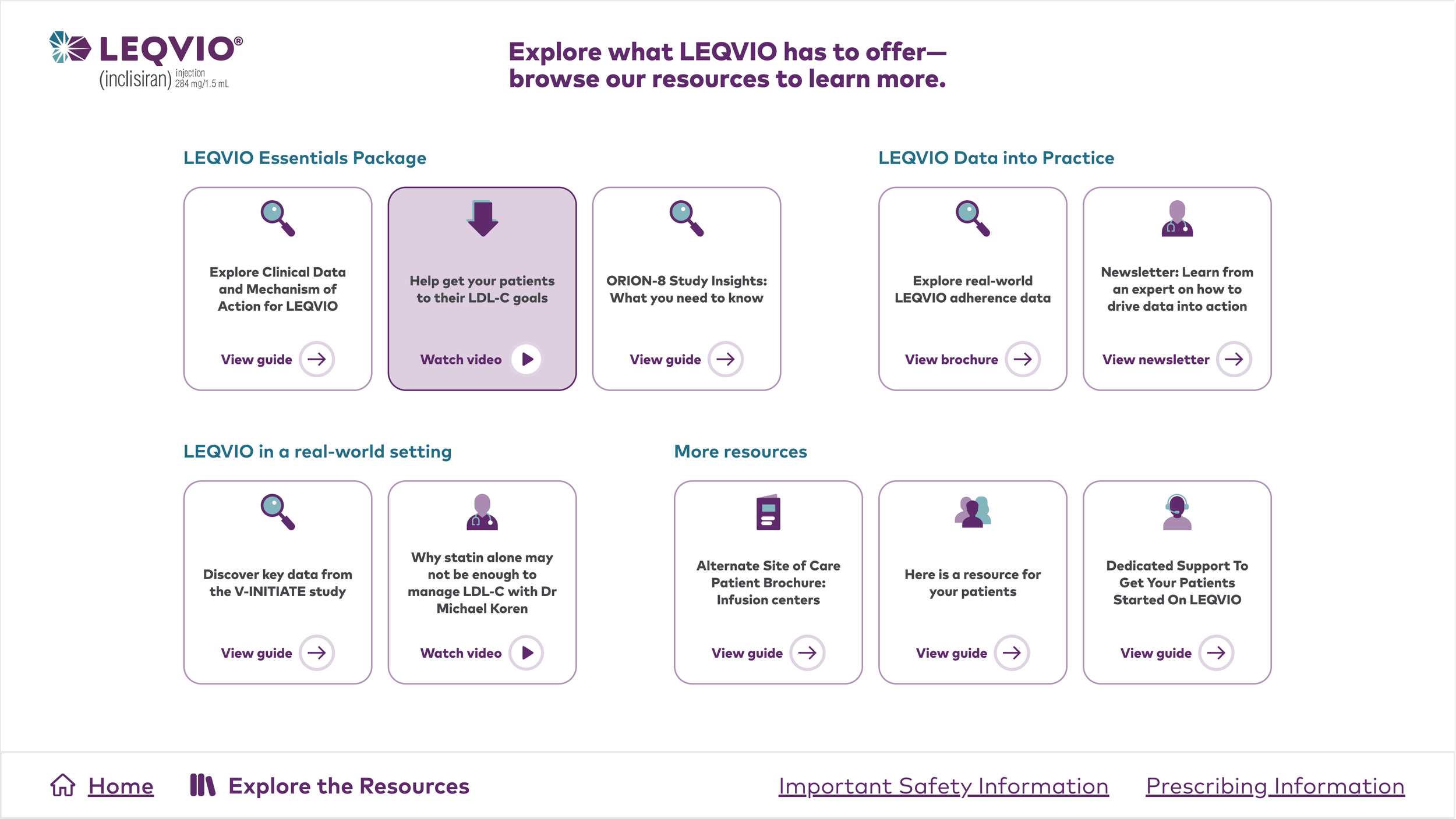
In addition to our initial idea of a brief quiz for HCP, the client requested to add a resource library that houses study insights, interactive visual aids, patient brochures, and videos. This last minute request created friction within the internal team because it added more choices for users and convoluted our original user flow. The client settled on making this resource library a secondary objective, one that should be accessed with a rep on standby.
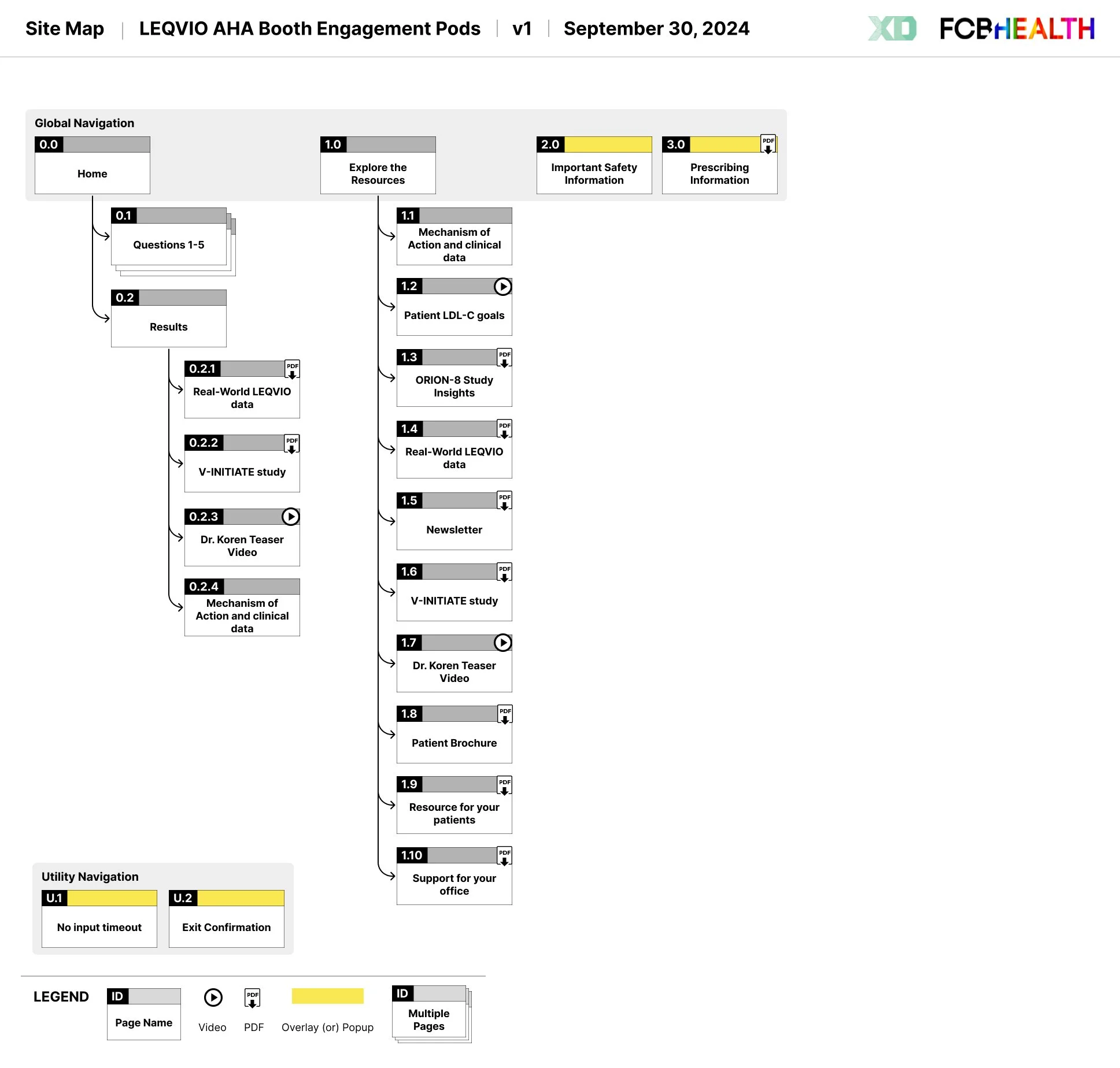
Site Map: To ensure a smooth transition to development, a site map was created based on the approved user flow to provide a clear roadmap for developers.
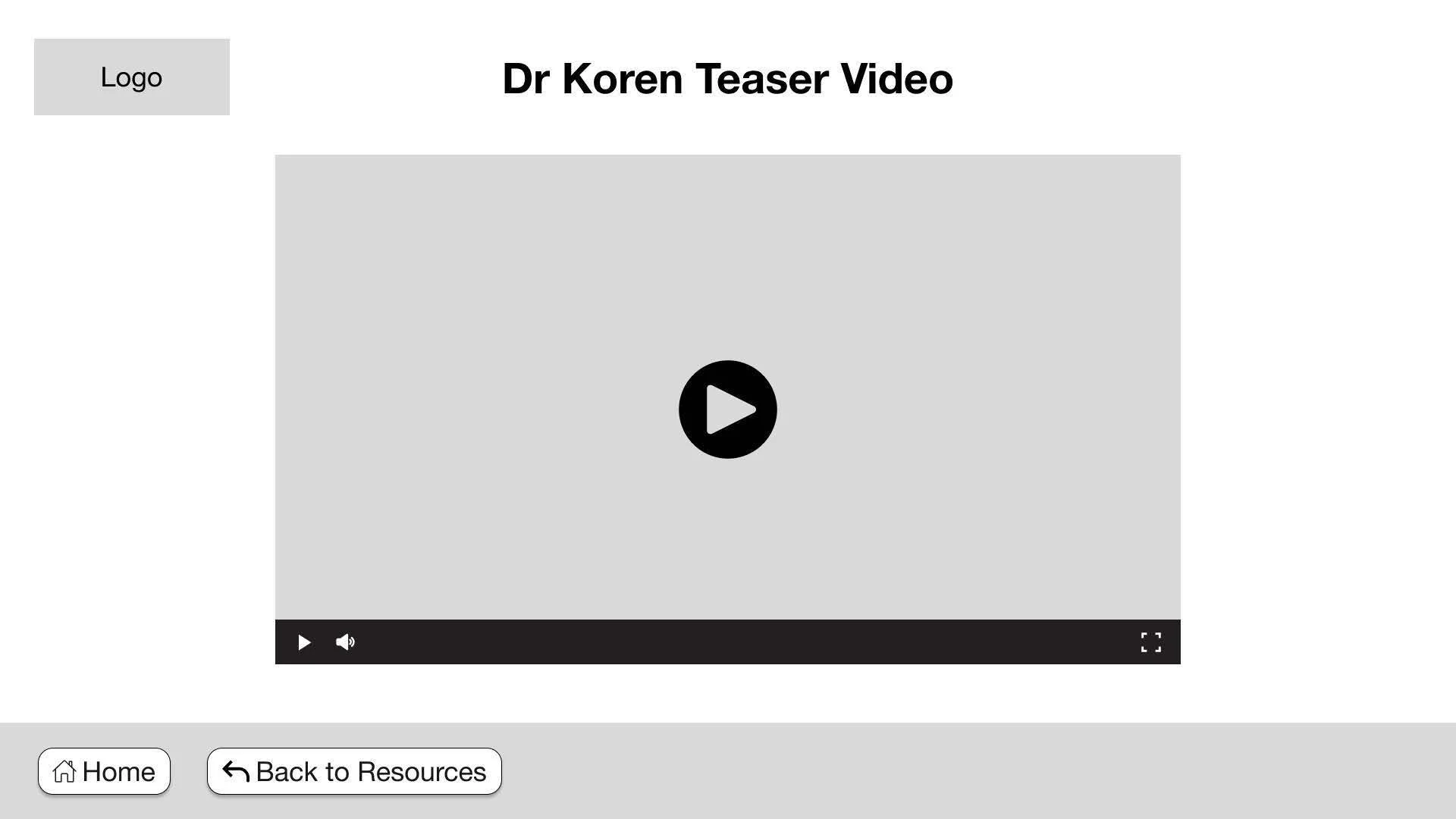
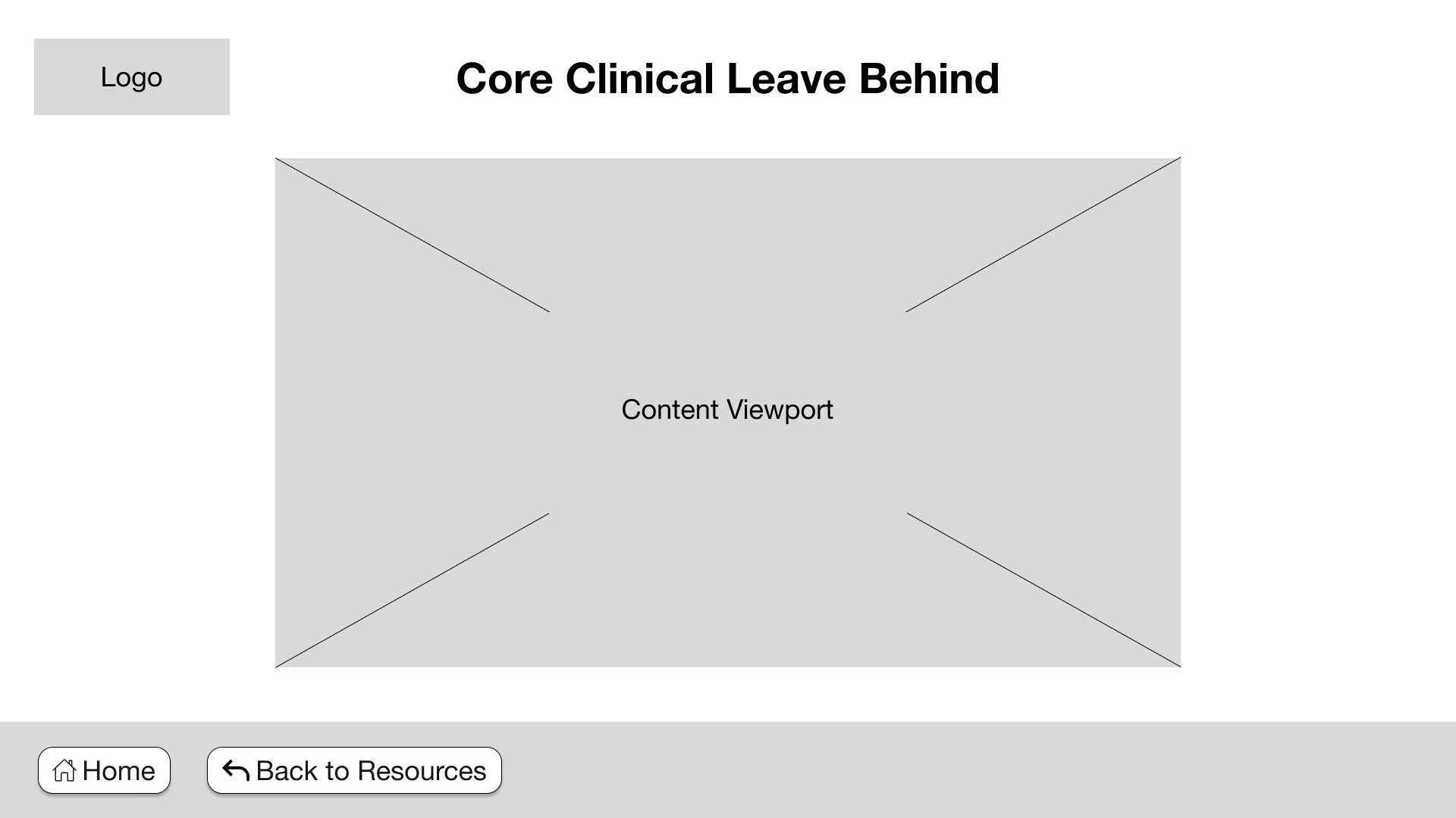
Wireframes: I created the following wireframes to obtain client approval before proceeding to layouts. Several key considerations during the design process included touch panel size and accessibility, ensuring optimal reach for all users.
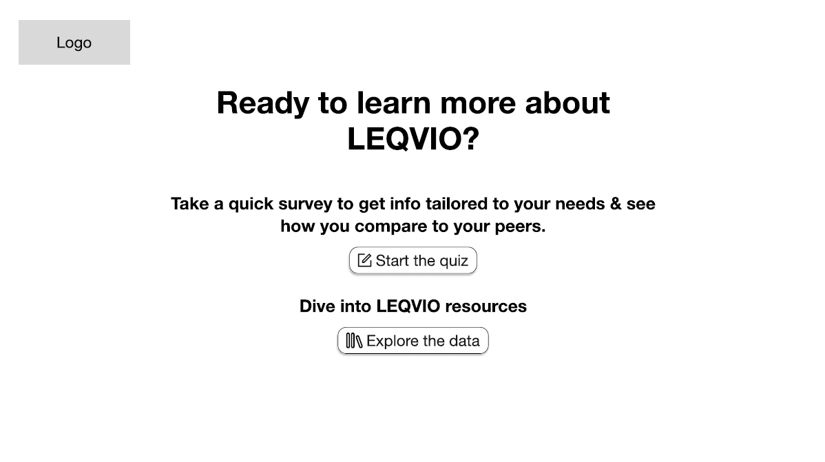
Users are presented with 2 choices: starting the quiz or going directly into the resource library.
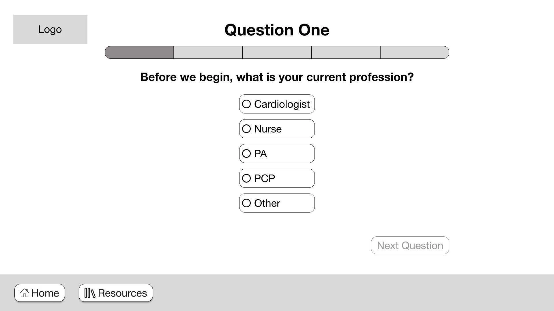
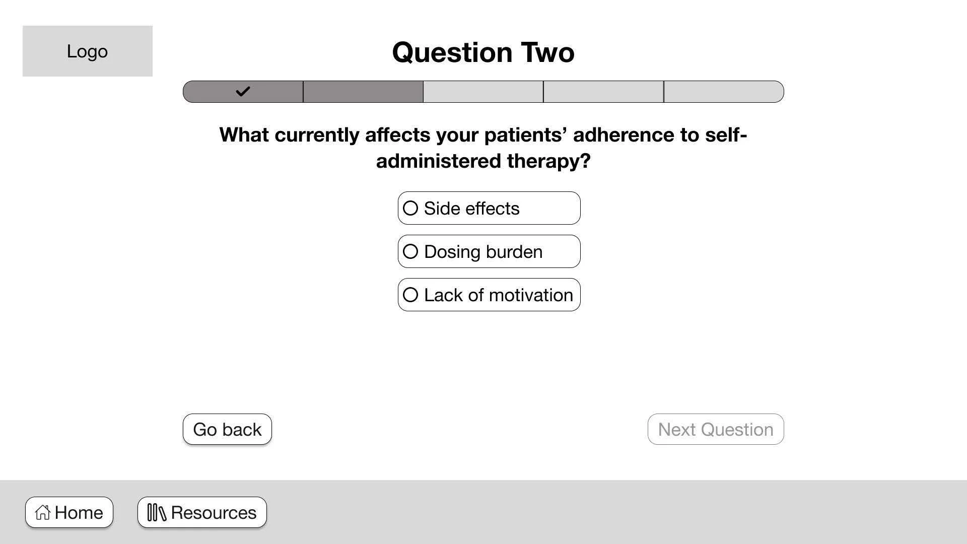
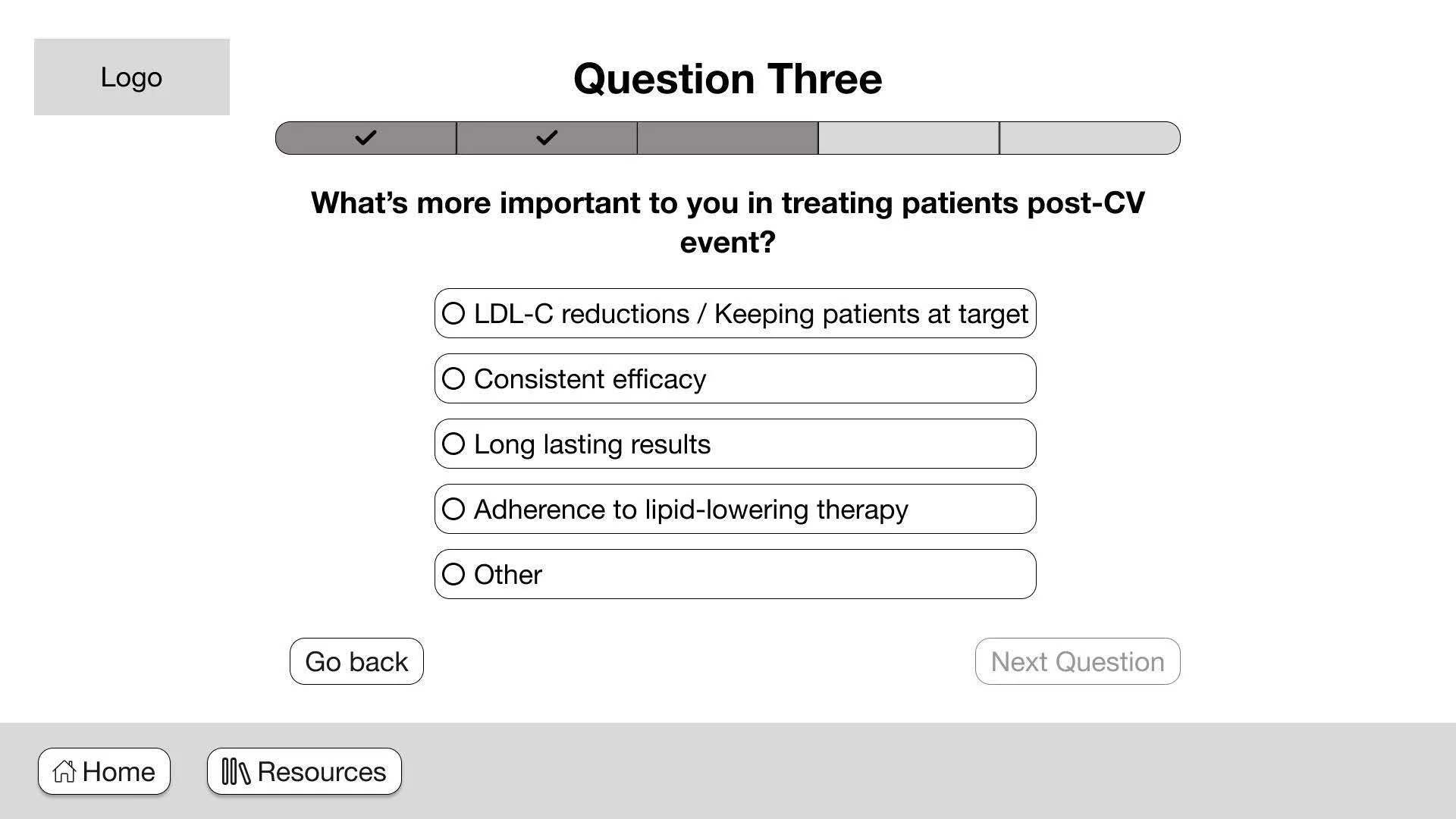
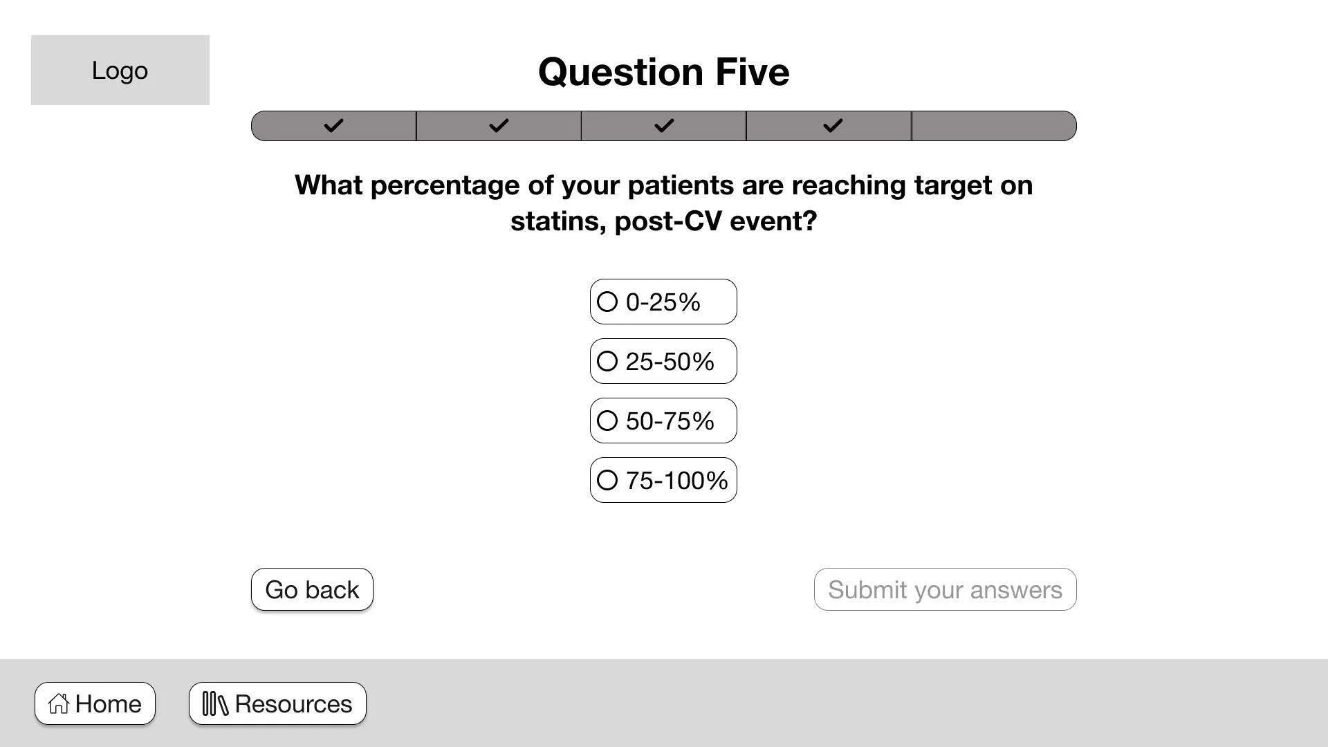
"Next question" button is set to inactive state to inform users of required action on screen. The progress bar below question one informs users how many questions are left.
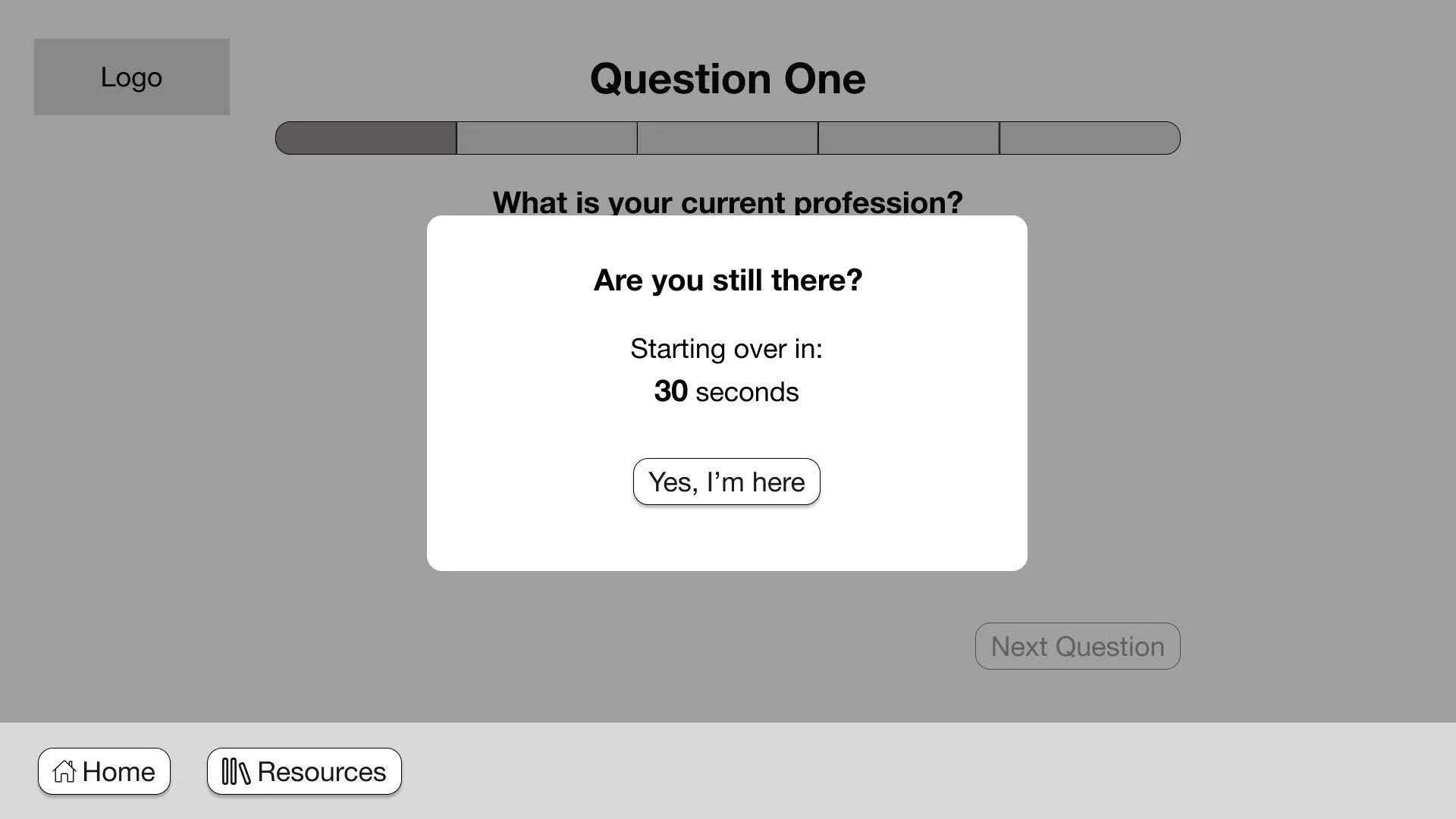
Automatic idle timer to kick in when touch panel is not interacted within 90 seconds.
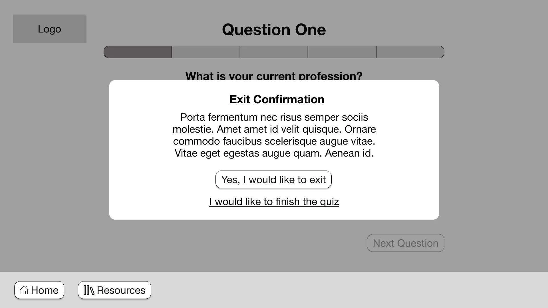
Exit confirmation to inform users the quiz will not be saved if they exit before finishing.
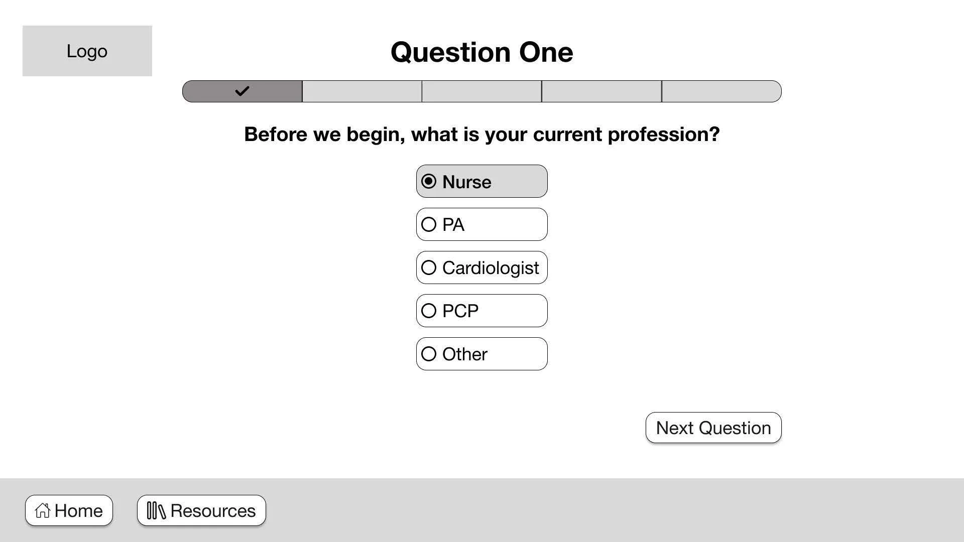
Active state when a question choice is selected. Both progress bar and "Next Question" is updated.
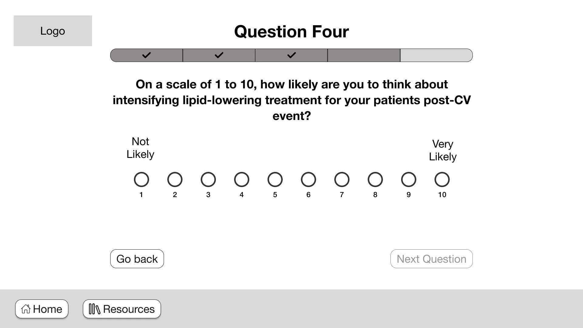
Linear Scale question type
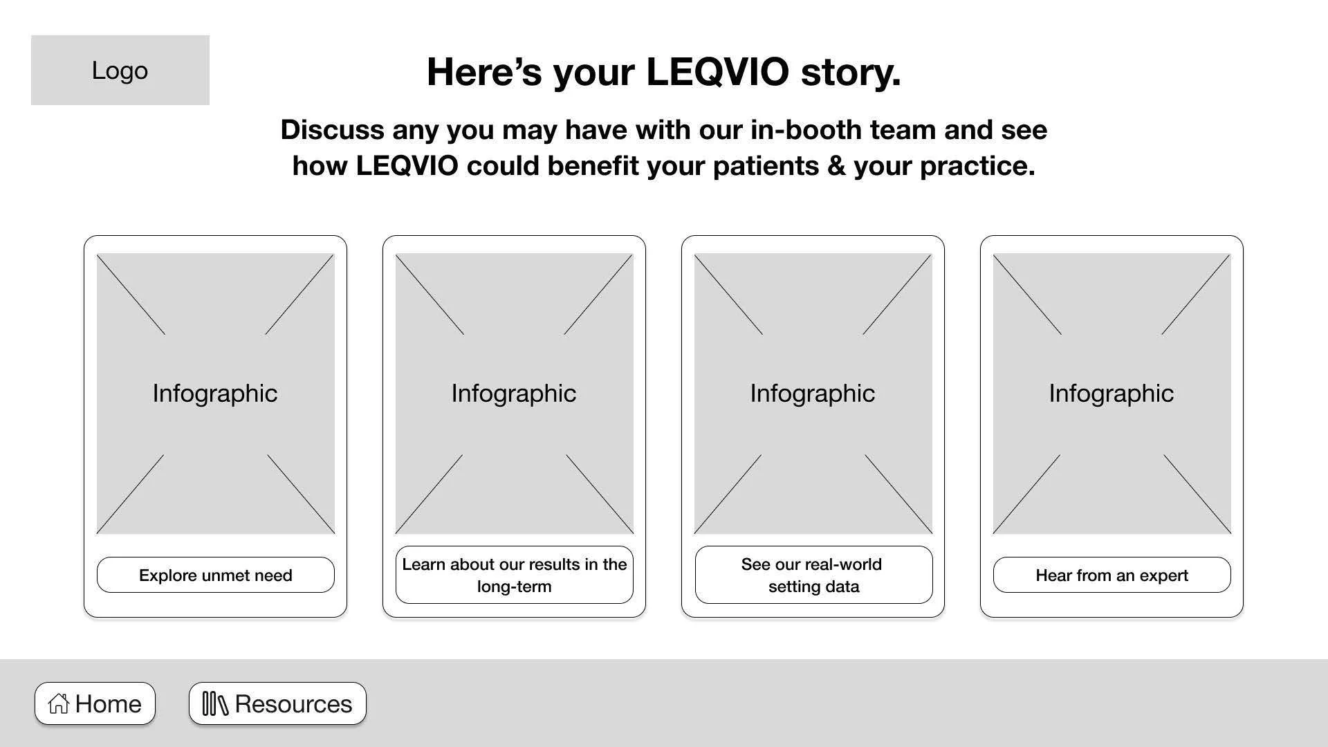
Results page with placeholder infographic of how the user answered the questions in comparison to their peers. Tapping on the buttons will link user to the specific resource page highlighting LEQVIO selling points.
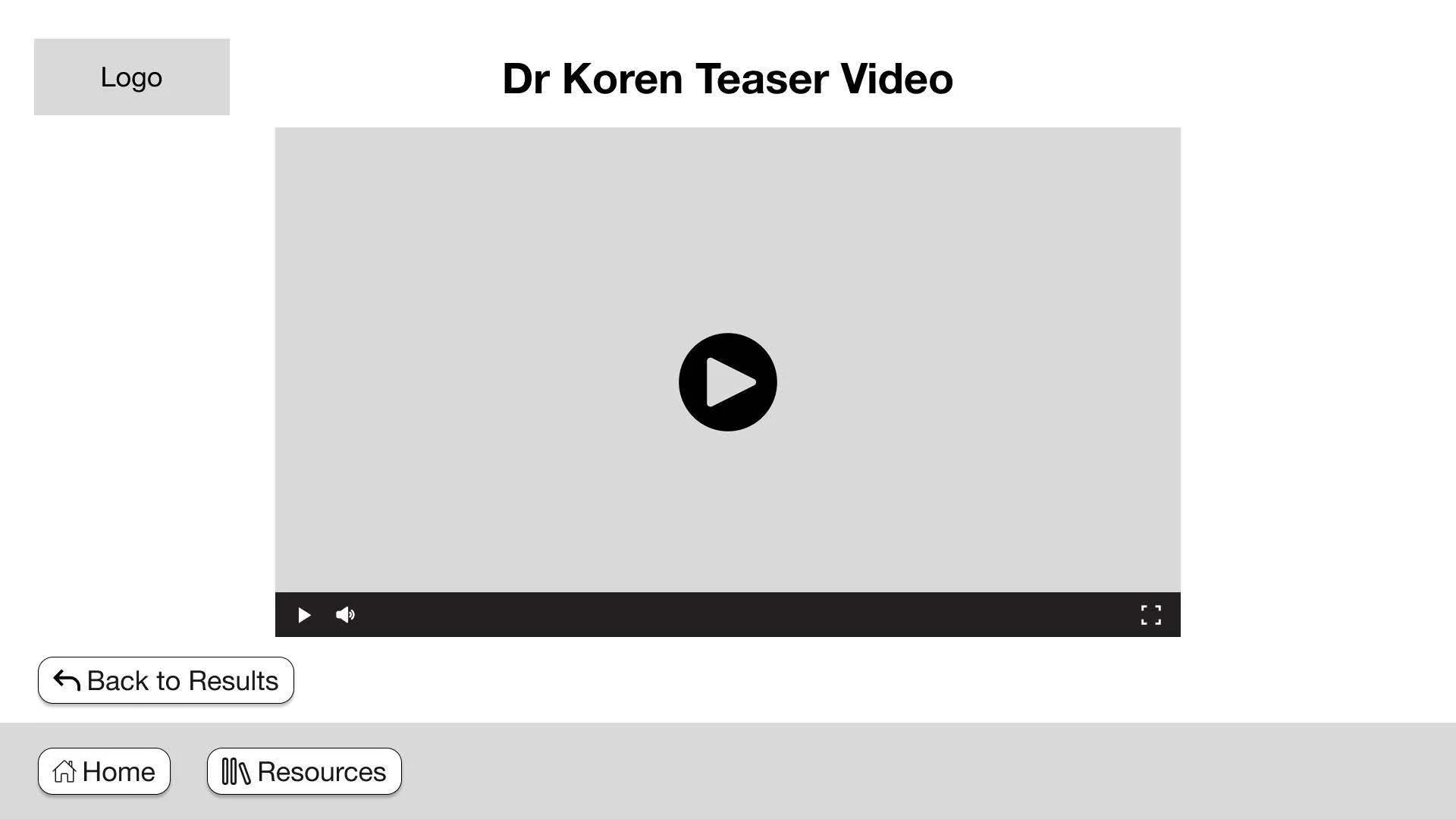
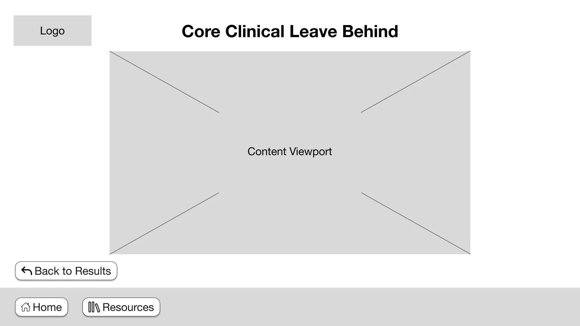
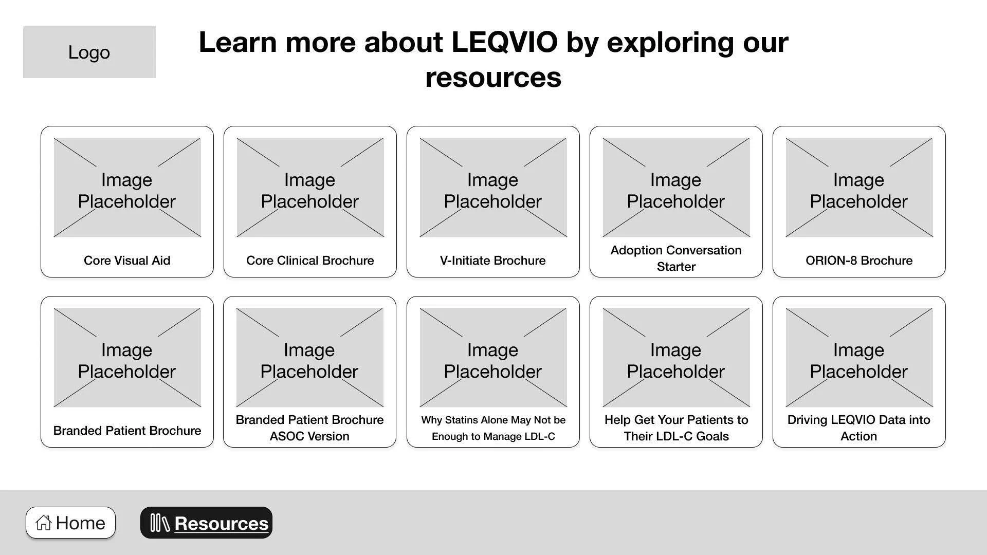
Resource library page allows users to skip the entire quiz and directly browse everything LEQVIO has to offer. This page is recommended to navigate with a rep to highlight key selling points.
Layouts: Below is the final layout our product design team created based on my approved wireframes. The layout underwent 15 rounds of revisions in WorkFront, incorporating feedback from copy, strategy, account management, UX, and digital inclusion.


Reflections:
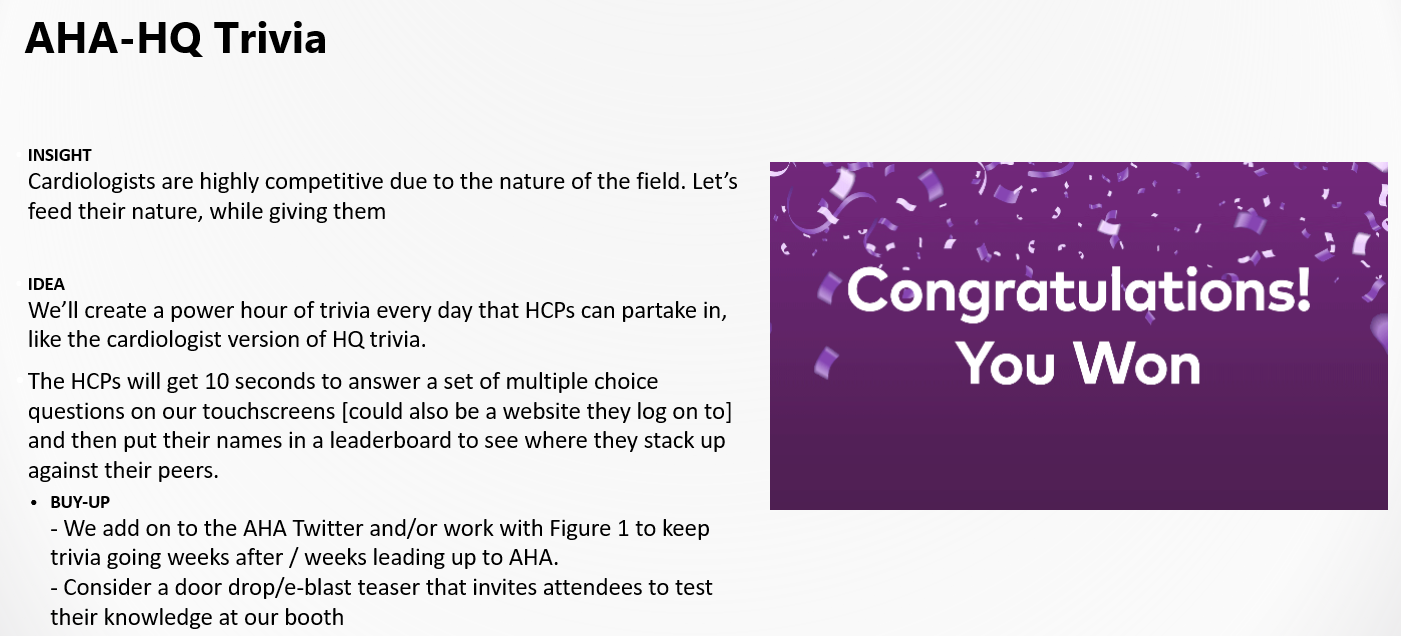
This project was rewarding, and I'm pleased with the final outcome. The overall idea and strategy was interesting from the start and I loved the way each team member contributed in our creative workshop because it was an environment that welcomed every ideas. Someone even suggested a game show like Family Feud with rewards to local restaurant chains but that was ultimately not feasible.
The major value feedback of the Cardiology Census was to showcase how HCP and their peers answered each question but there was a major design flaw that we realized when designing the initial user flows. The results page infographics highlight all user entries but there is nothing to compare to for the initial users because there is no existing data for each question. Therefore, this creates a poor user experience for the initial users of the touch panel. The client presented the solution of inputting answer data from the sales reps on the floor prior to the start of AHA Congress but that jeopardizes the legitimacy of the experience.
After the AHA Congress, we collected data from the user entries and noticed that there was a major drop off in completion after question two. Users were not completing the remaining questions, therefore we must re-evaluate the number of questions and their priority. I was very surprised to this finding because a five question quiz is relatively short and simple but that is not the case for HCPs at a busy convention surrounded by marketers constantly trying to grab their attention.