

Heirlum
Project Overview:
Heirlum is the first ever truly virtual grave marker that takes users’ crowdsourced digital memories and creates beautiful and interactive life stories that live within a virtual monument they can place anywhere in the world. Heirlum redefines the way we memorialize through an immersive digital keepsake that utilizes an augmented reality interface for its virtual monuments. Currently heirlum is still at an early stage in development and my team was tasked to create the onboarding process and primary feature for the heirlum mobile app in this project. In this project, I was one of two UX researchers teamed up with two other UX designers. My core responsibilities included creating survey questionnaires, conducting user interviews and usability testings, and data synthesis for design iterations.
Project Type: Mobile
Duration: 3 weeks
Challenge: Onboarding and Primary Feature Design
Tools Used: Figma, Adobe XD, Zoom, Google Sheets
Role: Research
Discover
Stakeholder Interview: We conducted an interview with the CEO of heirlum, Holly Jee, to get a better understanding of the origins of heirlum and its intended target users. We learned the following:
Initially heirlum was geared towards preserving the legacy of someone who had passed, however, Holly wanted the heirlum to take on a more neutral approach where anyone’s legacy could be preserved. She envisioned heirlum as a place where people could upload memories they are currently making.
Holly provided a brand style guide for us to follow. She requested us to use the same color palette and typography for our design of the onboarding process and primary feature design.
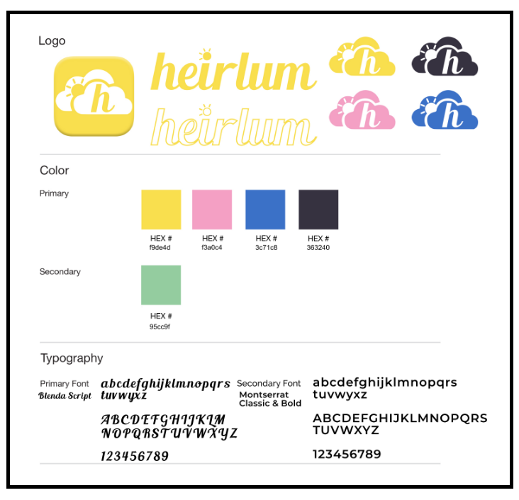
Brand Style Guide provided to us by Holly
Initial Survey: My team and I started off our research by sending a survey via Google Forms to gauge user interest in heirlum and start gathering users for usability testing for our mid and high fidelity prototypes. We collected a total of 20 responses and scheduled 16 users for two rounds of usability testing. We discovered that 100% of the participants agreed that specific locations remind them of friends or family members. This confirms to us that the inclusion of an Augmented Reality feature in the main function of heirlum would greatly enhance the immersive aspect of the app.

Define
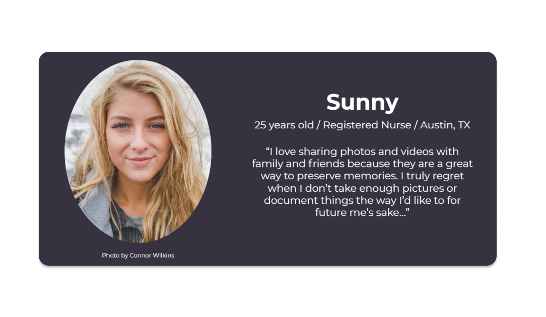
From the insights we received from our survey and stakeholder interview, we developed our persona Sunny.
Sunny is a 25 year old registered nurse from Austin, TX who truly values the digital media she shares with family and friends.
Similar to our respondents, specific locations make Sunny feel nostalgic.
We will be addressing the following problem statement in our design:
“Sunny needs a simple and immersive way to view and share her memories and those of loved ones in a way that is shareable because she wants to maintain their legacies.”
How might we display memories of someone or their loved ones in a way that is shareable and easy to locate?
How might we make an onboarding process easy for someone who may be in the middle of the grieving process?
How might we integrate the way someone views the legacy of themselves or loved ones into one centralized application?
Design
Based on what we learned from our survey and stakeholder interview, we started out the design process with a design studio to explore different concepts. Our goal is to create an onboarding process and primary feature that addresses the problem statement.
Design Studio: We have different options for the progress bars and went with a minimal aesthetics approach. Our goal for the sketches is to find a way to build a basic foundation of where things could “live” on each screen for the app.
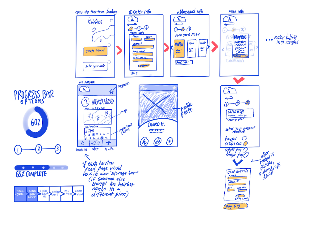
Courtesy of my teammate Ingrid, these are initial sketches of the onboarding process from the login screen to the payment plan page.
Wireframes: We utilized the primary fonts provided to us in the current design system. When designing the onboarding process, we wanted to make this process as simple as possible in order to account for the fact that someone like Sunny, our persona, might be going through the grieving process and it would be best to not bombard them by requesting too much information right off the bat.

The initial screens for the onboarding process. Users have the option to create a brand new account or enter an invitation code sent by a current user to sign in.
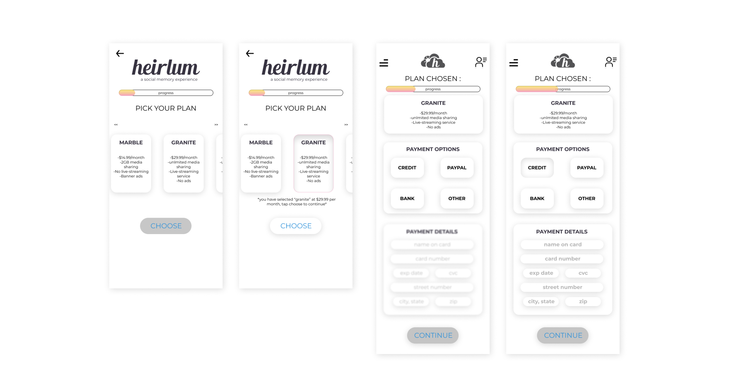
The payment plan options are listed in different tiers. The prices are not finalized and users have the option to continue for free and try out the app before entering their credit card information. This section is optional for the onboarding process.

These are the screens for the main feature of heirlum: creating a virtual marker for a love one. User gains access to this feature after the onboarding process and to begin, they must upload a profile picture for the virtual marker. There are a lot of customizations such as adding a name, short biography, more digital media, selecting the geographical location, and inputting a special date on the calendar.
Testing and Iterations
We conducted two rounds of usability test and participants were asked to complete two tasks in each round with a specific scenario. The first round is based of heirlum mid-fidelity prototype and the second round is based of heirlum high-fidelity prototype. The main distinction between the mid-fidelity prototype and the high-fidelity prototype is the visuals and minor quality of life changes made on the newer version. Quality of life changes were made based on recommendations from the first round of usability testing.
Usability Testing Round 1
Task 1: Participants were tasked to create and set up an heirlum account as a first time user. In order to complete this task, they must go through the entire onboarding process by entering their personal information for account set up, selecting a payment plan, and finishing the payment information section.
Task 1 Criteria

62 seconds criteria was determined by the average time it took my team to complete the task. We defined user errors as any unwarranted clicks or actions within the onboarding process. The system usability score was determined by this survey given to participants after each task.
Task 1 Results

Despite the low success rate of completion within the time limit and the less than impressive errors users made during the test, we received a satisfactory system usability score of 88.
Task 2, Participants were tasked to fill out all the components in creating an heirlum by uploading a profile picture of the marker, adding a short biography, and selecting a meaningful date at the end.
Task 2 Criteria

Similar to task 1, we determined the criteria time of completion based on the average time it took my time to complete the task 2. Task 2 should take longer to complete in comparison to task 1 because there are a lot more screens in the main feature function. The other two criteria remains the same as task 1 to maintain consistency throughout testing. Here is the survey used to determine the system usability score for this task.
Task 2 Results

The results are very similar to the first task but we see an increased in the amount of users completing the task on time but a decrease in the number of users completing the task within the error threshold. Despite the subpar completion rates, we received an overall positive system usability score of 78.
First Round Iterations
Usability Testing Round 2
For the second round of usability testing, we introduced the participants to the new prototype with the iterations made from the first round of testing while maintaining the same task, scenario, and criteria.
Task 1 Results

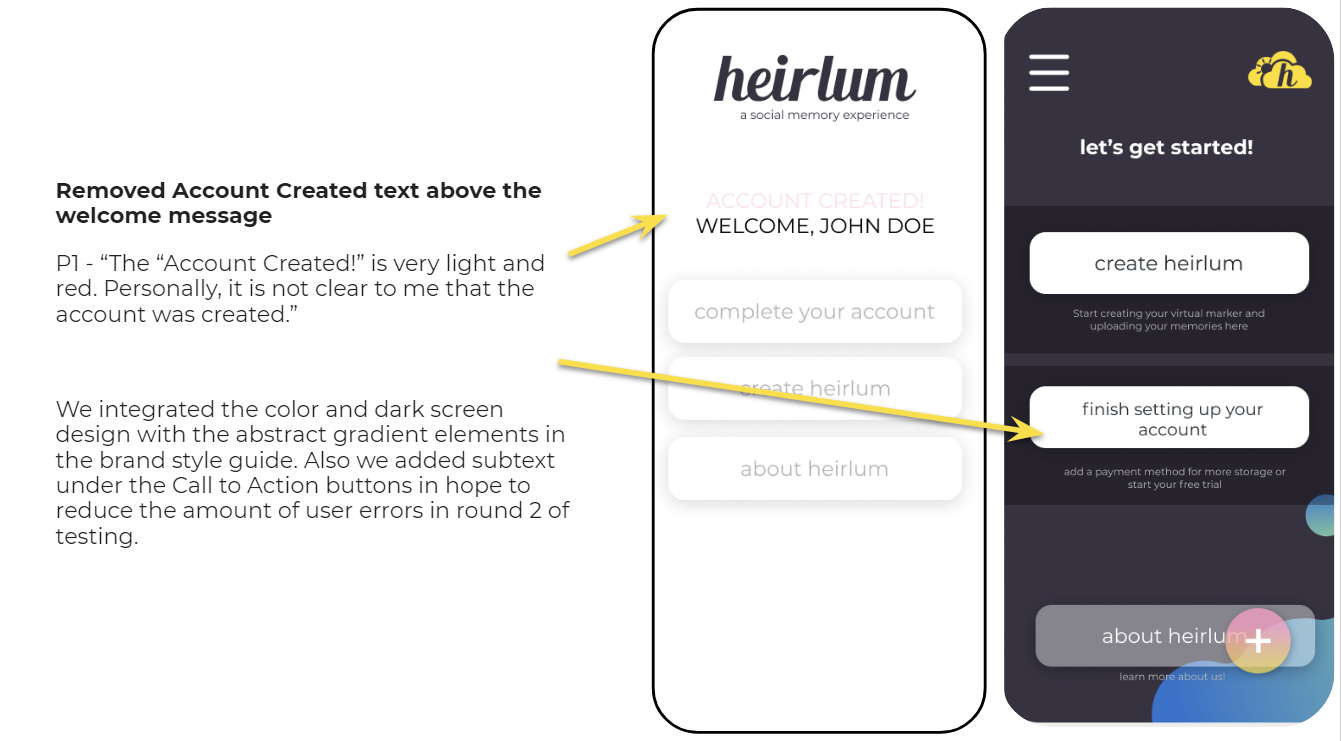
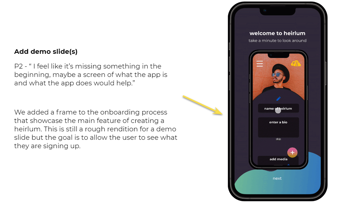
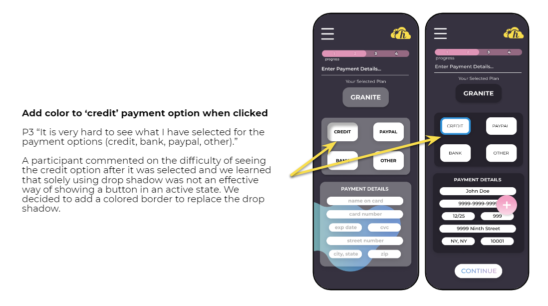
Despite the iterations made after the first round of testing, only 1 out of 8 participants were able to complete the first task within the time constraint of 72 seconds. The low completion rate in the first task could be explained by the addition of the Demo Slide, which naturally increased the amount of time taken to complete the first task. We see an increase for users completing the same task with 3 errors or less to 6 from 4 and a system usability score of 89.06 from 87.91. This can be explained by the improvement to the visuals and user interfaces we made from the previous round. By providing color and additional subtext to call to action buttons, we were able to reduce user errors and increase the system usability score.
Task 2 Results

We see an improvement in all three criterias for task completion in comparison to the first round of testing! Participants were able to navigate throughout the creating an heirlum feature faster while making less errors in comparison to the first round of testing.
Second Round Iterations
Final Prototype
Stretch Goal
My team created a sample of how the Augmented Reality screens might look within the heirlum app. This is a stretch goal we had for ourselves because it is a significant feature based on the initial survey that 100% of the participants said a specific location reminded them of an event or person. The complicity of implementing this feature would require developers to utilize the API of Niantic, the AR industry leader. Our current screens are far from perfect but if we have more time we would conduct more user testing for optimization.
Reflections
Looking back, this project was very exciting, challenging, and rewarding–all at the same time. My team and I were really grateful and happy that we got to work on an app with such an interesting and unique concept. It was really challenging for my team to get on the same page because heirlum is still at a very early stage in development. We all had so many different ideas on how to create the best version of heirlum while keeping the stakeholders’ and users’ needs in mind. In the end, we have to settle on what’s realistic within our time frame and scrap out other ideas such as a livestreaming function. It was really challenging personally for me because this is the first time I am taking on a more research heavy role. It was a great learning experience because I have to trust my teammates on the visual design aspects and step out of my comfort zone by being more analytical in the design thinking process.